08.3. How to plot a light curve
RSP Aspect: Portal
Contact authors: Greg Madejski and Melissa Graham
Last verified to run: 2025-03-04
Targeted learning level: intermediate
Introduction:
This tutorial demonstrates how to plot the light curve of a difference image analysis object (diaObject).
In this demonstration, an RR Lyrae star is used.
This star has coordinates RA, Dec = 62.1479031, -35.7991348 deg and an object identifier number diaObjectId = 1651589610221862935.
As is appropriate for variable stars, the forced photometry fluxes from PSF model fits in the direct (not difference) images are used.
The diaObjectId for a given coordinate can be obtained from the DiaObject table by
making a spatial query on the coordinates with a small radius (a few arcseconds) that returns the diaObjectId column.
1. Execute the query.
Go to the Portal’s DP0.2 Catalogs tab, switch to the ADQL interface, and execute the query below.
The query will return the modified julian date (MJD) from the CcdVisitId table,
and the forced PSF flux on the direct image (psfFlux)
from the ForcedSourceOnDiaObject table, for the target star only.
It will also return the flux error and the band (filter) of the observation.
SELECT cv.expMidptMJD, fsodo.psfFlux, fsodo.psfFluxErr, fsodo.band
FROM dp02_dc2_catalogs.ForcedSourceOnDiaObject as fsodo
JOIN dp02_dc2_catalogs.CcdVisit as cv
ON cv.ccdVisitId = fsodo.ccdVisitId
WHERE fsodo.diaObjectId = 1651589610221862935
2. The default plot is an all-filter light curve. The first two columns, date and flux, are plotted on the x- and y-axes of the default Active Chart for all filters (Figure 1).
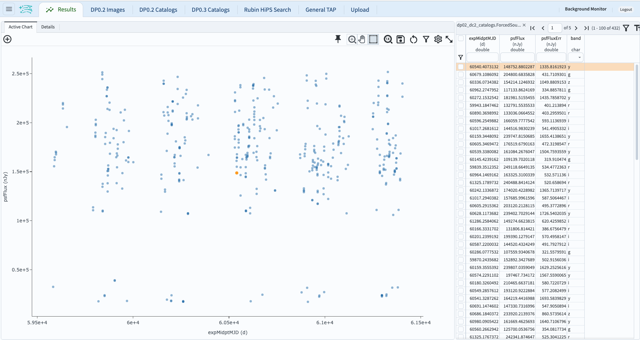
Figure 1: The default results view showing the light curve with all filters as blue points.
3. Plot a single-filter light curve. In the table header, in the “band” column, click on the constraint box and then select “i” in the pop-up window and click “Apply”. The plot will update to display i-band fluxes only (Figure 2).
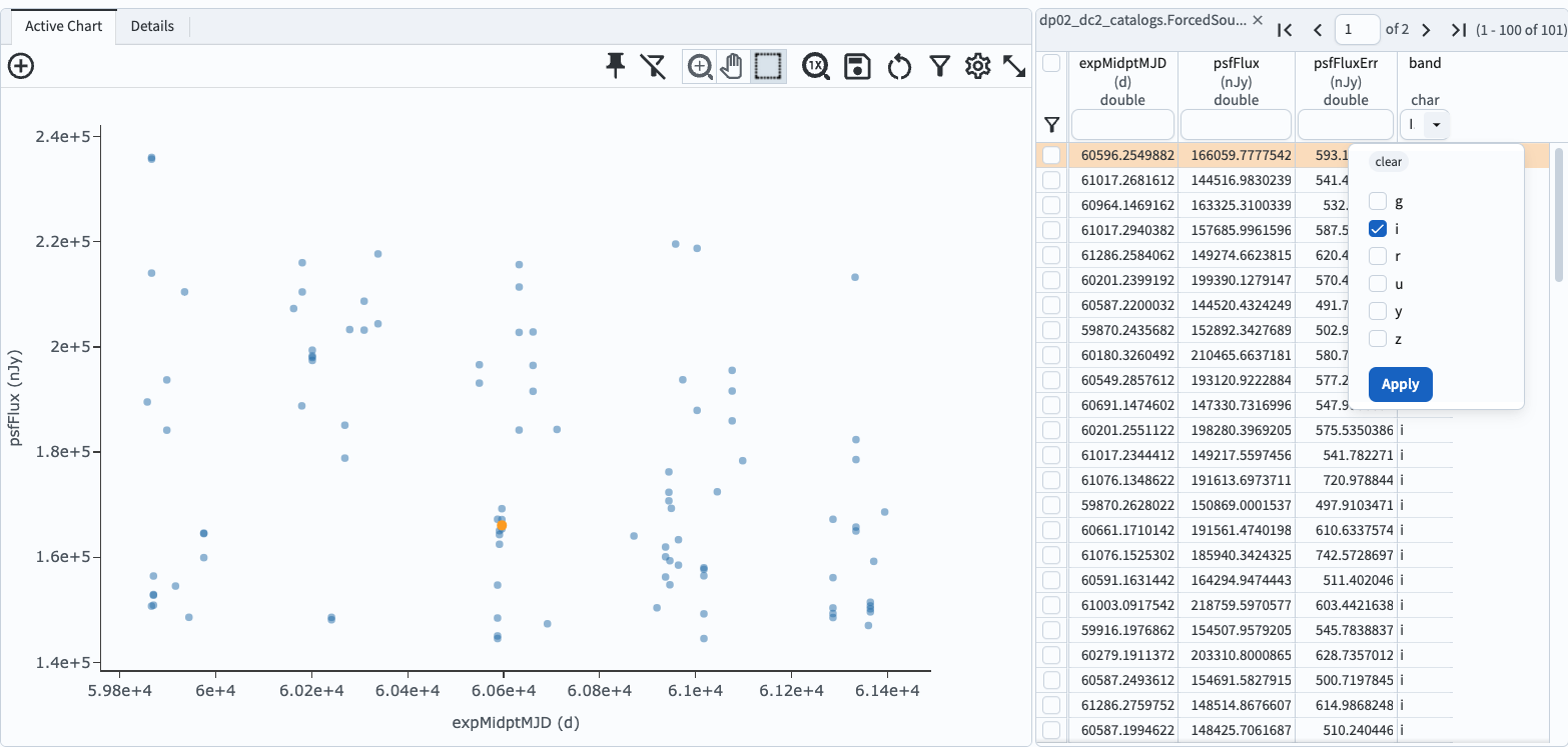
Figure 2: The results view with only i-band data selected and plotted.
4. Color markers by band in a multi-band light curve. To set marker color based on band (filter), create a new column in which the band is represented as a number (Figure 3) and then a color map based on those numbers (Figure 4). The plot will then display points colored by band (Figure 5).
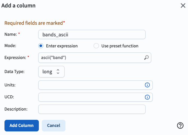
Figure 3: The “Add a column” pop-up window to create a new column of integer numbers to represent each band.
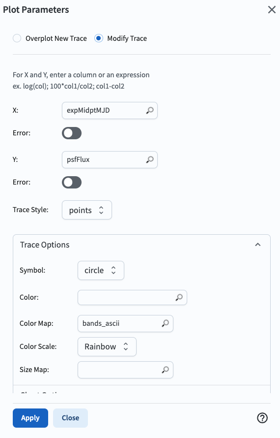
Figure 4: The “Plot Parameters” pop-up window with the Trace Options set to define a color map based on the new “bands_ascii” column.
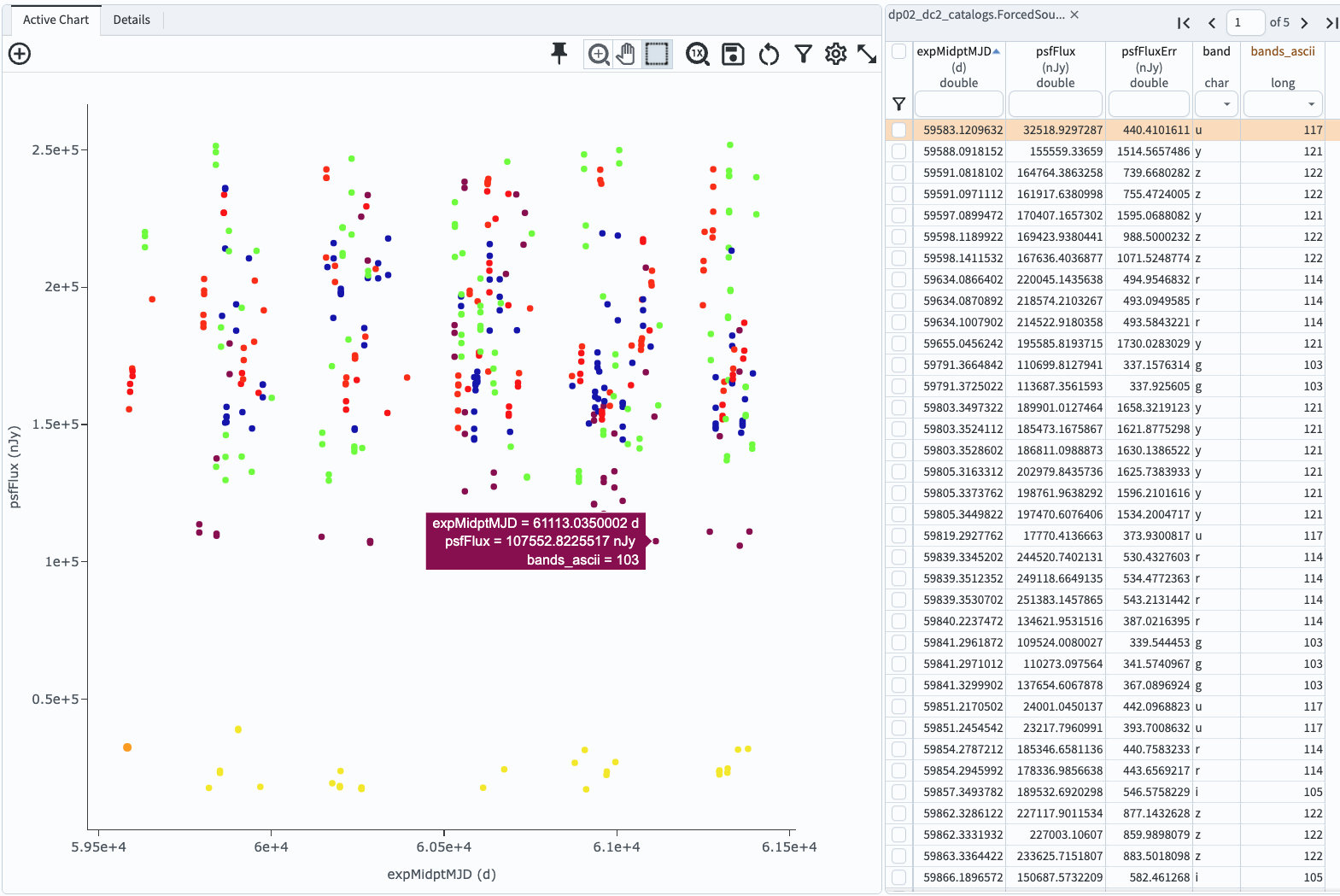
Figure 5: The results view with the new “bands_ascii” column and the plotted points colored by the Rainbow color map.
Notice: In the future, the trick of creating an ascii column to represent band as an integer will not be needed. The development of Portal functionality to plot multi-band light curves in which points are colored by filter is planned.
Return to the list of DP0.2 Portal tutorials.