How to manipulate plotted data
This “How-to” exercise will show how to plot data, and manipulate such a plot. The example below will illustrate it for a color-magniture diagram for a sample of objects.
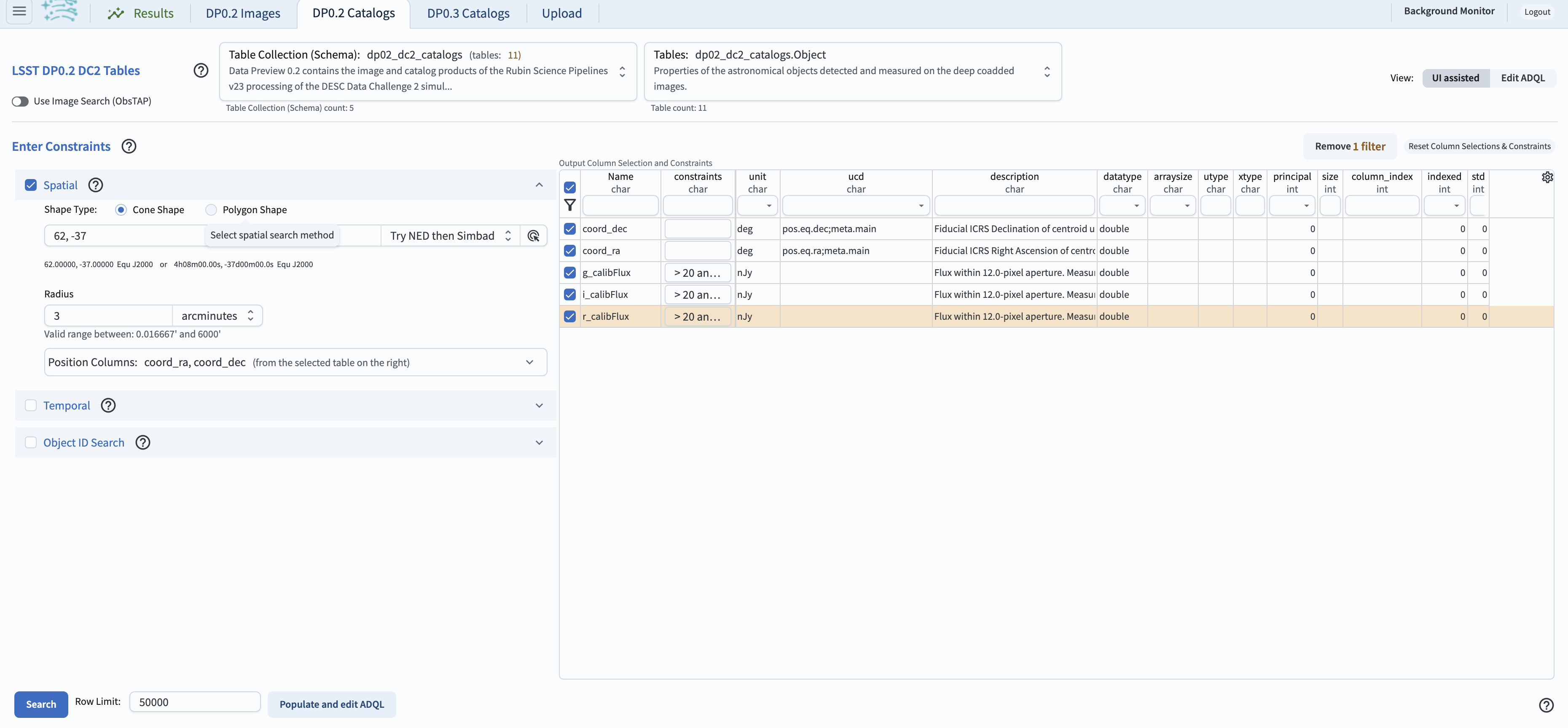
For the purpose of this exercise, it is necessary to first select data for plotting. This can be accomplished in the “UI assisted” aspect of the Portal, by executing a search in the DP0.2 Object catalog using a 3 arcminute cone near the DC2’s central coordinates. The search will return only the five data columns: “coord_ra”, “coord_dec”, and “g” “r” and “i_calibFlux” - those are selected by checking boxes to the left of the desired row. It will also impose the contraints that the flux must be between 20 and 1000 nanojansky. The ready-to-execute seach is in the screenshot below. Note that the displayed rows are limited only to the checked ones: this is accomplished by clicking on the funnel above the selected boxes.

An example query of the DC2 Object catalog.
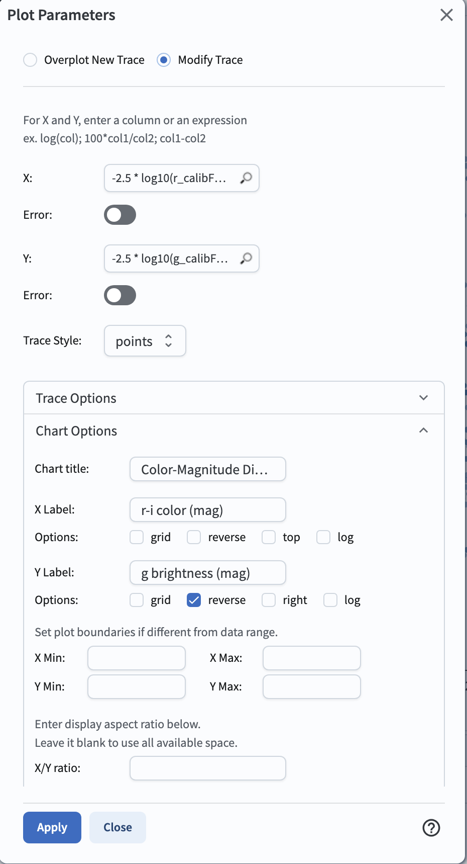
Manipulating the plotted data and converting fluxes to magnitudes: Once the data were retrieved by executing “search” on the query above, the manipulation of the plotted data can be done by selecting the single gear “Plot Parameters” icon above the active chart. This will result in an opening of a pop-up window as illustrated in the next figure. This example shows how to plot the data using magnitudes rather than fluxes. Currently, the tables contain only fluxes (no magnitudes). In the future, magnitudes will be available.
To create a color-magnitude diagram from the fluxes, for DP0.2 it is necessary to apply the standard conversion from nanojansky to AB magnitude in the X and Y boxes as, e.g., “-2.5 * log10(g_calibFlux) + 31.4” for the Y axis, and “-2.5 * log10(r_calibFlux)+2.5 * log10(i_calibFlux)” for the X axis. Note that the Y axis needs to be reversed (via checking the “reverse” button as shown on the screen shot), to have the faint objects at the bottom, and the bright objects at the top.
The pop-up window also allows to add the chart title and label the axes (via the “Chart Options” box), and to choose a color for the data points (via the “Trace Optipns” box). To modify the plot, one needs to click “Apply” and then “Close”.

The plot settings pop-up window.
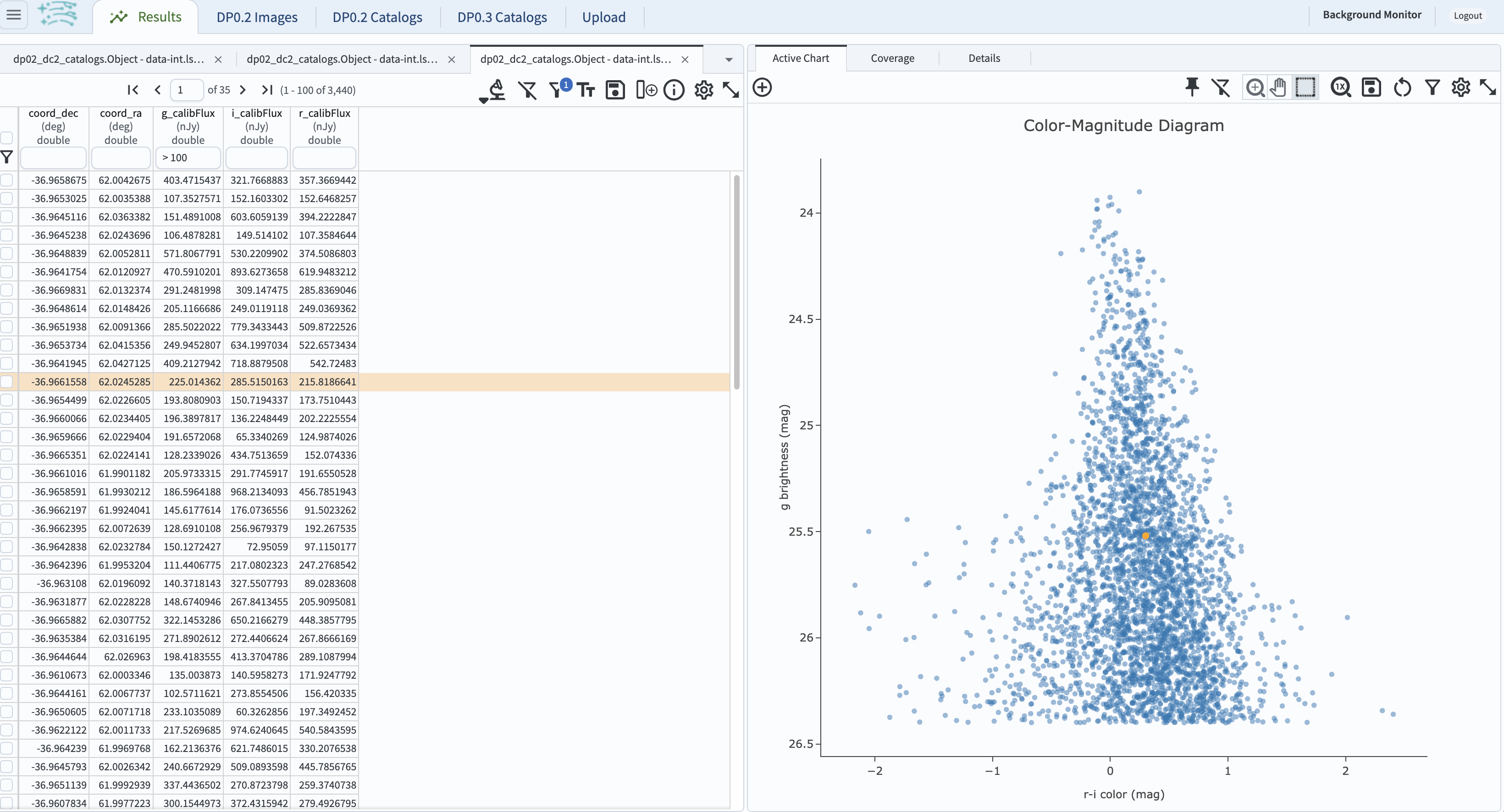
At this point, additional cuts can be applied to the table data being plotted. In the figure below, the g-band flux is limited to > 100 (via the constraint entered in the header of the column “g_calibFlux”). This imposes a sharp cutoff in the y-axis values at 26.4 mag. The windows which are displayed can be adjusted by using the “hamburger” menu at upper left. Clicking on that icon will drop down a “Results Layout” sub-menu, which in turn allows selecting the desired display.
Note that the displayed data in the table and the plotted data points are linked. Clicking on any row in the table on the left will result in the corresponding plot point for the selected row in the table will be differently colored. Also, hovering the mouse over the plotted data will show the x- and y-values in a pop-up window.

Screenshot of the results from the query described above, with the table on the left, and the r-i color vs. g magnitude plot n the right.