Portal Usability Test Answer Key
Contact authors: Andrés A. Plazas Malagón and Gloria Fonseca Alvarez
Last verified to run: 2024-01-22
Link to Portal usability test: https://forms.gle/EVqX29G3i2o7cvXE6
Introduction: The following is the answer key for the tasks in the Portal usability test. The test was designed to understand how users interact with the Portal functionality. Anyone is welcome to do the Portal usability test and submit their responses via the Google form linked above.
Beginner Task 1
Retrieve the g_psfFlux, g_calibFlux, and the g_extendedness columns from the DP0.2 Object catalog for objects within 15 arcminutes of the galaxy cluster at Right Ascension 55.75 degrees and Declination -32.27 degrees. Plot the psfFlux vs. the calibFlux. In the results table, impose a constraint to only plot objects with extendedness equal to 1. Change the plot symbols to open purple circles.
Step 1. Query the DP0.2 Object catalog
1.1. Next to “LSST DP0.2 DC2 Tables”, choose the Table Collection to be “dp02_dc2_catalogs” (left drop-down menu) and the Table to be “dp02_dc2_catalogs.Object” (right drop-down menu).
1.2. Under “Enter Constraints”, enter the coordinates “55.75, -32.27” for “Coords or Obj Name”. Next to “Radius”, from the drop down menu choose “arcminutes” and then enter “15”.
1.3. Select the output columns “coord_ra”, “coord_dec”, “g_psfFlux” “g_calibFlux” and “g_extendedness” and “detect_isPrimary”. Click on the filter icon to show only the selected columns.
1.4. In the “constraints” column, enter “=1” for “detect_isPrimary”.
1.5. Set the “Row Limit” to 20000, to only retrieve 20000 objects.
1.6. Click “Search” at lower left.
Step 2. Create a g psfFlux vs. g cmodelFlux diagram
2.1. Click on the Active Chart settings icon (two gears) and set “X” to be “g_calibFlux”, and “Y” to be “g_psfFlux”. Click “Apply”.
Step 3. Plot only extended objects
3.0. In the results table, under the column “g_extendedness”, enter “= 1”. Click on the filter icon.
3.1 Click on the Active Chart settings icon (two gears) and click on “Trace Options”. Next to “Symbol”, from the drop down menu choose “circle-open”. Next to “Color”, enter “purple”. Click “Apply”.
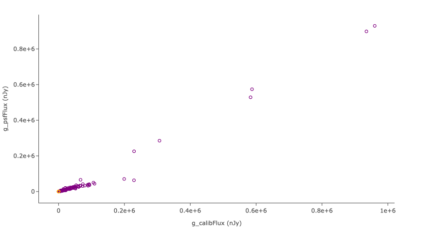
The g psfFlux vs g calibFlux diagram for extended objects
Beginner Task 2
Create a g-r color vs. i magnitude diagram using the calibFlux columns in the DP0.2 Object catalog, for all objects within 120 arcseconds of Right Ascension 60 degrees and Declination -35 degrees. Zoom in on the clump of points with color values approximately in the range of -4 < g-r < 4. Save the plot as a PNG file to your local computer.
Hint: After retrieving the {band}_calibFlux columns, use the expression (-2.5*log10({band}_calibFlux) + 31.4) to convert the fluxes in nanoJankys to magnitudes in the AB system.
Step 1. Query the DP0.2 Object catalog
1.1. Next to “LSST DP0.2 DC2 Tables”, choose the Table Collection to be “dp02_dc2_catalogs” (left drop-down menu) and the Table to be “dp02_dc2_catalogs.Object” (right drop-down menu).
1.2. Under “Enter Constraints”, select the box to the left of “Spatial”. For “Coords or Obj Name”, use the coordinates “60, -35”. Next to “Radius”, from the drop down menu choose “arcseconds” and then enter “120”.
1.3. In the table on the right, under “Output Column Selection and Constraints”, select “coord_ra”, “coord_dec”, “detect_isPrimary”, “g” “r” and “i_calibFlux”. Click on the filter icon to show only the selected columns.
1.4. In the “constraints” column, enter “=1” for “detect_isPrimary”.
1.5. Click “Search” at the lower left.
Step 2. Create a g-r color vs i magnitude diagram
2.1. Click on the Active Chart settings icon (two gears) to change the plot parameters. Set “X” to be “(-2.5 * log10(g_calibFlux)) - (-2.5 * log10(r_calibFlux))” and “Y” to be “-2.5 * log10(i_calibFlux) + 31.4”.
2.2. Click on “Chart Options” and set “X Label” to “color (g-r)”. Set “Y Label” to “magnitude (i)”, and underneath check the “Options” box for “reverse”. Click “Apply”.
Step 3. Zoom-in and save the diagram
3.1. Click on the Zoom-in icon (magnifying glass with a plus) and click and drag over the clump on points.
3.2. Click on “Pin Chart” and then the save icon (next to the 1x magnifying glass) to download the chart as a PNG.
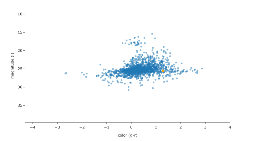
The g-r color vs i magnitude diagram
Intermediate Task 1
Retrieve the four DP0.2 processed visit images (PVI) images obtained with LSST band i, before the date of MJD 59840, whose boundaries contain the point with Right Ascension 55.75 degrees and Declination -32.27 degrees. In the results view, choose the option to display the six images in a grid. Use the “Image center drop down” tool to center the first displayed image on the search coordinates. Use the “Image alignment drop down” tool to align and lock all displayed images by the World Coordinate System (WCS) and zoom-in 3 times
Step 1. Retrieve processed visit images
1.1. Check the “Use Image Search (ObsTAP)” box below “LSST DP0.2 DC2 Tables”.
1.2. Under “Observation Type and Source”, choose “Calibration Level” 2, for PVIs.
1.3. Under “Location”, from the drop-down menu next to “Query Type”, choose “Observation boundary contains point”. For “Coords or Obj Name”, use the coordinates “55.75, -32.27”.
1.4. Under “Timing”, from the drop-down menu next to “Time of Observation”, choose “Overlapping specified range” and select “MJD values”. Enter “59840” for “End Time”.
1.5. Under “Spectral Coverage”, select “By Filter Bands” and select “i”.
1.6. Click “Search” at lower left.
Step 2. View and align the images
2.1 Click on “Bi-view Tables” in the upper right corner to show just one image and the table side-by-side. To display the PVIs, select the “Data Product” tab.
2.2. Above the image, click on the grid icon (hover-over text “Tile all images in the search result table”) to simultaneously view all 4 i band PVIs.
2.3 Click on the first image and choose the “center” icon (hover-over text “Image center drop down.”), and in the box next to “Center On” enter coordinates, “55.75, -32.27”, and then click “Go and Mark”.
2.4. Click on the align icon above the image (hover-over text “Image alignment drop down.”) and under “Align and Lock Options” select “by WCS”.
2.5. Click the Zoom icon and then Zoom-in (magnifying glass with a plus) 3 times.
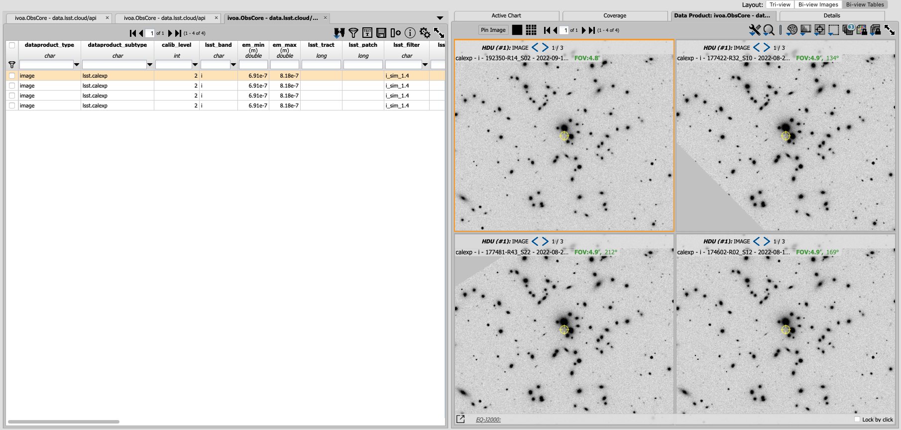
A zoom-in of the aligned i-band PVIs
Intermediate Task 2
Use the ADQL interface to obtain, from the DP0.2 DiaSource table, an r-band light curve for the Type Ia supernova which has a diaObjectId of 1250953961339360185. Retrieve the r-band fluxes and their errors derived from a linear least-squares fit of a PSF model, and the effective mid-exposure time, for all diaSources associated with this diaObjectId. Plot the light curve as the flux as a function of time, with error bars associated to each flux point. Change the plot style to use connected points, the point style to be red circles, and then sort the results by midPointTai. Update the plot axes labels to be “PSF Difference-Image Flux” and “MJD of the Exposure Midpoint”.
Hint: In the ADQL query, the filter name will need to be formatted as a string (e.g., ‘r’).
Step 1. Query the DiaSource table with ADQL
1.1. On the upper right of the portal aspect, click on “Edit ADQL”.
1.2. Enter the following ADQL code into the “ADQL Query” box:
SELECT diasrc.diaObjectId, diasrc.diaSourceId,
diasrc.filterName, diasrc.midPointTai, diasrc.psFlux, diasrc.psFluxErr
FROM dp02_dc2_catalogs.DiaSource AS diasrc
WHERE diasrc.diaObjectId = 1250953961339360185
AND diasrc.filterName = 'r'
1.3. Click “Search” at lower left.
Step 2. Create a light curve plot
2.1. Click on the Active Chart settings icon and set “X” to be “midPointTai”, and “Y” to be “psFlux”. Under “Y”, select “Error” and enter “psFluxErr”.
2.2. From the drop-down menu next to “Trace Style”, choose “Connected points” and under “Trace options” enter “red” for “Color”.
2.3. Click on “Chart Options” and set “X Label” to “MJD of the Exposure Midpoint” and “Y Label” to “PSF Difference-Image Flux”. Click “Apply”.
2.4. Click on the table column “midPointTai” to sort the results.
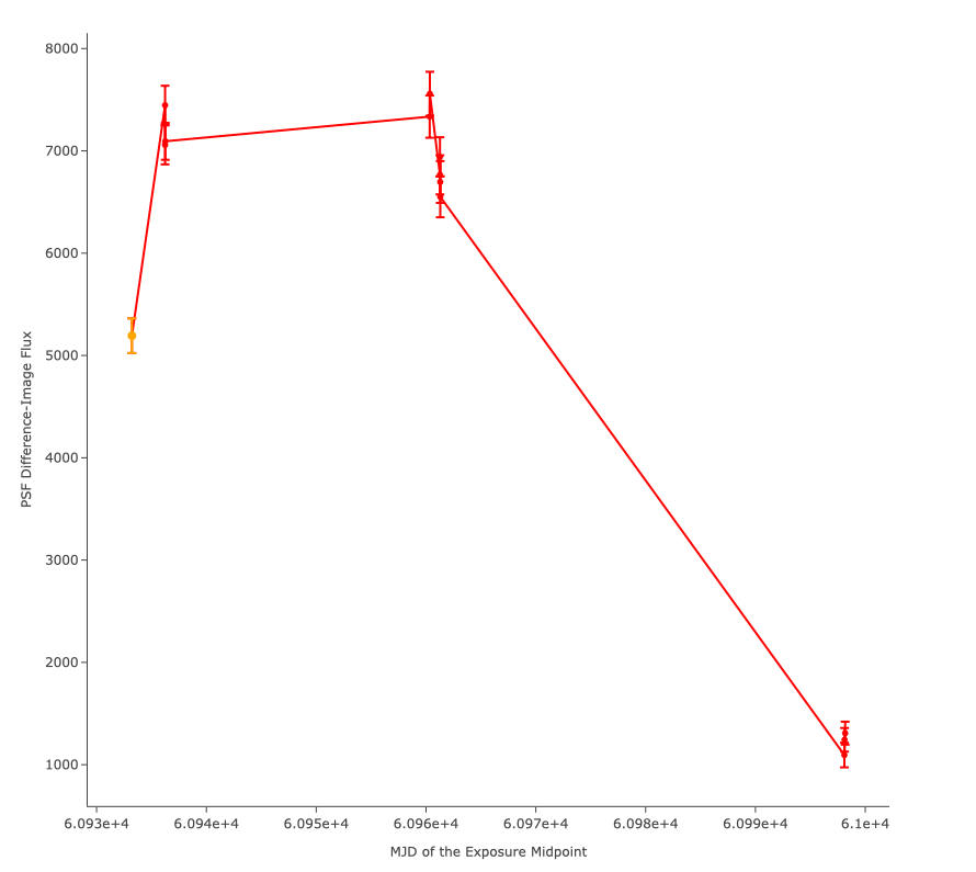
The light curve after sorting by the exposure midpoint
Experienced Task 1
The following figure, taken from the DP0.2 data products page, has three panels: the grid of tracts in the DC2 simulation area, the image of tract 3828, and a zoom-in image approximately centered near a particularly bright elongated galaxy. Use the Portal Aspect to find the ObjectId of that galaxy in the DP0.2 Object catalog.
Hint: Do an image search to find the right ascension (RA) and declination (DEC) coordinates of the object and then a catalog search.
Hint: Query for bright extended objects near the tract center and then visually review the results until you find the target.
Step 1. Find the coordinates of the galaxy
1.1. Check the “Use Image Search (ObsTAP)” box below “LSST DP0.2 DC2 Tables”. Under “Enter Constraints”, unselect the box to the left of “Observation Type and Source” and “Location”.
1.2. In the table on the right, under “Output Column Selection and Constraints”, search for “lsst_tract” and enter “=3828” in the “constraints” column.
1.3. Click “Search” at lower left.
1.4. Under the “Coverage” tab, visually inspect each patch and find the coordinates of the galaxy. The galaxy is in patch 38, with coordinates around “56.74, -36.08”.
Step 2. Query for bright extended objects
2.1. On the upper right of the portal aspect, click on “Edit ADQL”.
2.2. Query for extended objects brighter than 20th magnitude, near the coordinates of the galaxy, including objectId.
SELECT coord_dec, coord_ra, detect_isPrimary, objectId,
g_extendedness, r_extendedness, i_extendedness,
scisql_nanojanskyToAbMag(g_cModelFlux) as gmag,
scisql_nanojanskyToAbMag(r_cModelFlux) as rmag,
scisql_nanojanskyToAbMag(i_cModelFlux) as imag
FROM dp02_dc2_catalogs.Object
WHERE CONTAINS(POINT('ICRS', coord_ra, coord_dec),CIRCLE('ICRS', 56.74, -36.08, 1))=1
AND (detect_isPrimary =1
AND scisql_nanojanskyToAbMag(g_cModelFlux) < 20 AND g_extendedness =1
AND scisql_nanojanskyToAbMag(r_cModelFlux) < 20 AND r_extendedness =1
AND scisql_nanojanskyToAbMag(i_cModelFlux) < 20 AND i_extendedness =1)
Step 3. Narrow down the number of objects and visually inspect
3.1. Click on the Active Chart settings icon (two gears) and choose “Add New Chart”. Next to “Radius”, from the drop down menu, choose “Histogram”. Enter “gmag” for “Column or Expression”. Repeat for “rmag” and “imag” to see the distribution of magnitudes in the three bands. Particularly bright objects have magnitudes < 16.
3.2. In the results table, under the column “rmag” and “imag”, enter “< 16.5” to narrow down the results.
3.3. Select the “Coverage” tab and click on the first result from the table. Zoom-in to visually inspect the object.
3.4. Scroll through and visually inspect the results until finding the galaxy (objectId = 1650235011896472264).
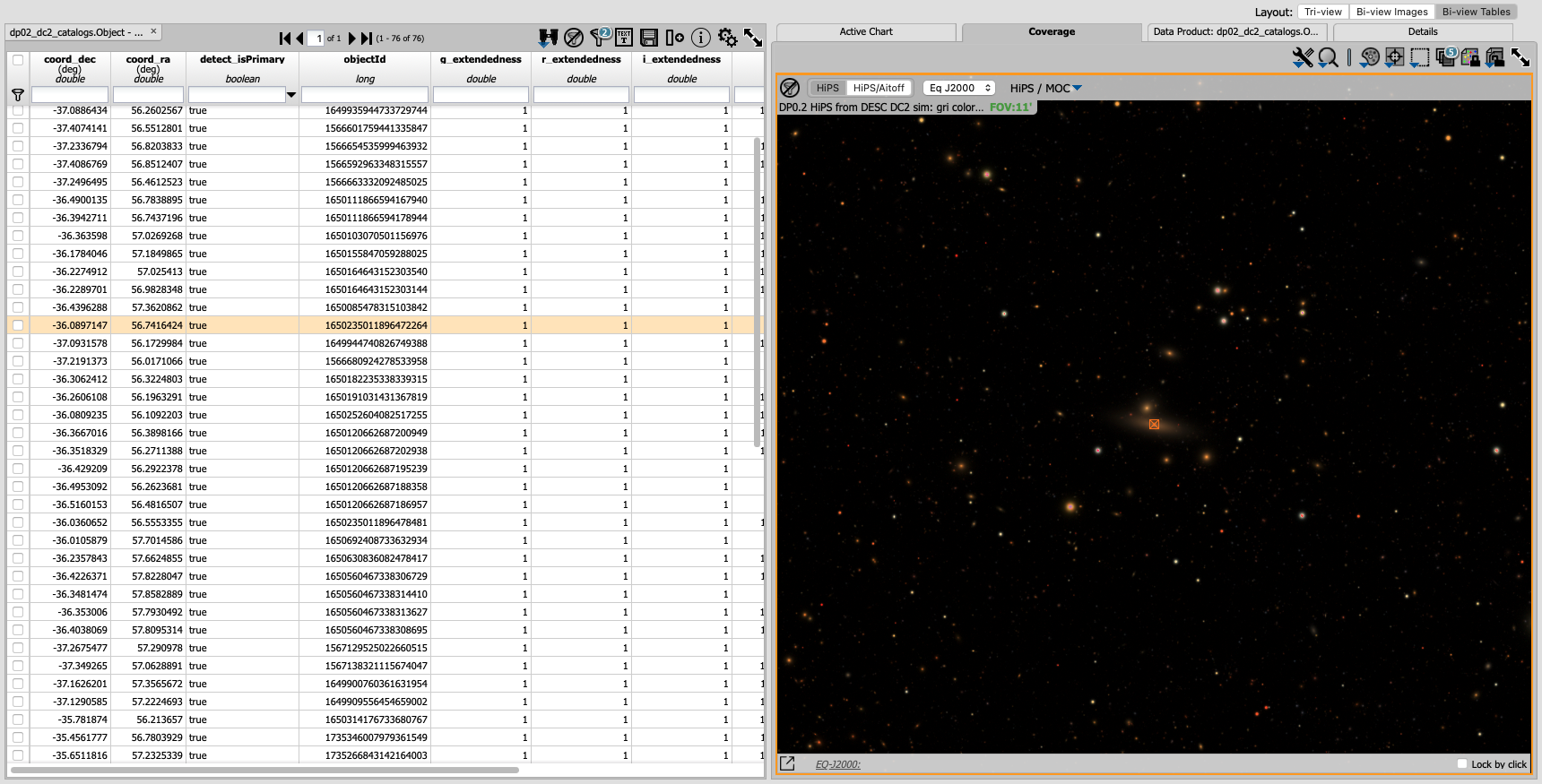
Image of the particularly bright elongated galaxy
Experienced Task 2
Query the DP0.2 Object catalog for the galaxy cluster around Right Ascension 3h43m00.00s and Declination -32d16m19.00s to visualize the region where the cluster is and plot the red-sequence* in a color-magnitude diagram (for example, r-i vs i), as illustrated in the first image below. Then, select the points in the red sequence to highlight the cluster members in the image, as shown in the second image below.
Hint: use a search radius of 200 arcseconds.
Hint: you can use the scisql_nanojanskyToAbMag SQL function to convert fluxes to magnitudes.
Definition: The red sequence in galaxy clusters refers to a tight correlation observed in color-magnitude diagrams, where many of the galaxies in a cluster show a similar red color and brightness, indicating they are older, more evolved galaxies with less star formation.
Step 1. Visualize the region of the cluster
1.1. Under “Enter Constraints”, enter the coordinates “3h43m00.00s, -32d16m19.00s” for “Coords or Obj Name”. Next to “Radius”, from the drop down menu choose “arcseconds” and then enter “200”.
1.2. Select the output columns “coord_ra”, “coord_dec”, “r” and “i_cModelFlux”, “r” and “i_extendedness” and “detect_isPrimary”. In the “constraints” column, enter “=1” for “g”, “r” and “i_extendedness” and for “detect_isPrimary”.
1.3. Click “Search” at lower left.
1.4. Under the “Coverage” tab, click on the layers icon (hover-over text “manipulate overlay display”) and unselect “Coverage”.
Step 2. Create a color-magnitude diagram
2.1. Click on the Active Chart settings icon (two gears) and set “X” to be “to be “-2.5 * log10(i_cModelFlux) + 31.4” and “Y” to be “(-2.5 * log10(r_cModelFlux)) - (-2.5 * log10(i_cModelFlux))”.
2.2. Under Chart Options, set “Chart title” to “Red Sequence”. Set “X Label” to “i” and set “Y Label” to “r-i”. Click “Apply”.
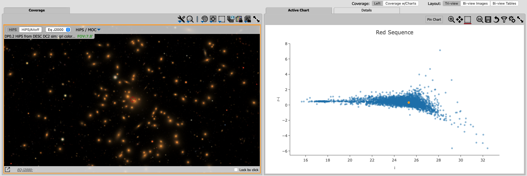
Red sequence in a color-magnitude diagram
Step 3. Highlight the cluster members
3.1. On the chart on the right, click and drag over the points roughly with 16 < i < 20.
3.2. Click on the filter icon (next to “Pin chart”) to show only the selected points.
3.3. Under the “Coverage” tab, click on the layers icon (hover-over text “manipulate overlay display”) and select “Coverage”.
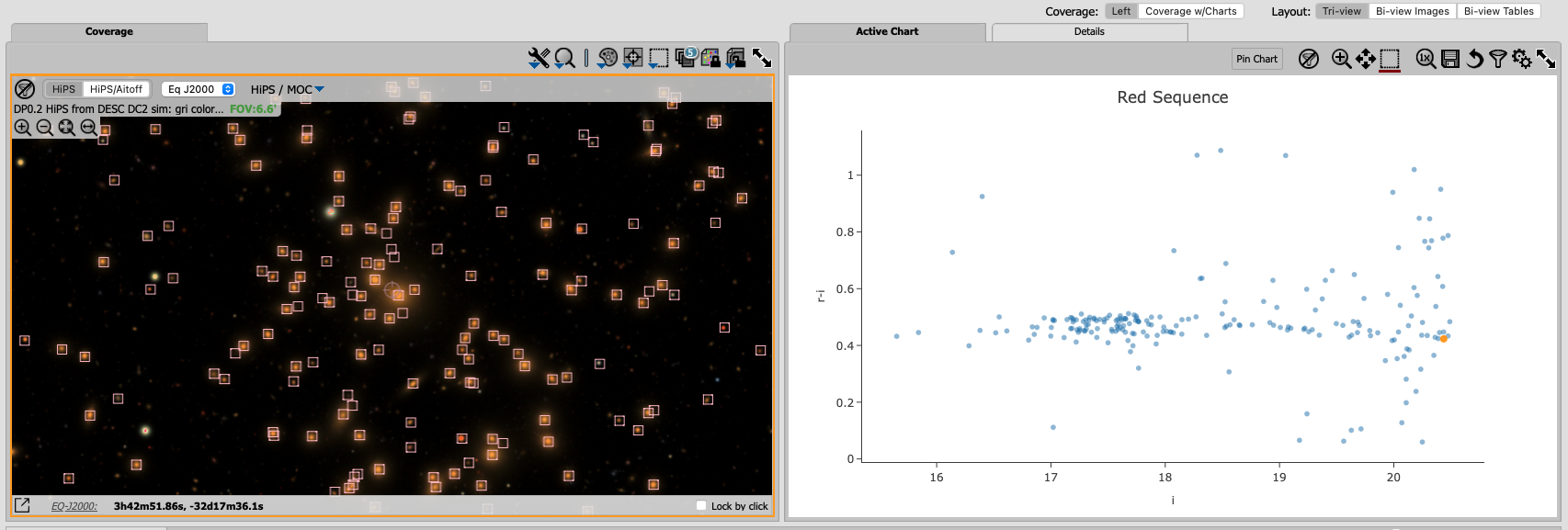
Red sequence with cluster members highlighted