01. API TOPCAT Bright Stars Color-Magnitude Diagram Tutorial (beginner)
Contact authors: Douglas Tucker and Leanne Guy
Last verified to run: 2023-11-30
Targeted learning level: beginner
Introduction: This tutorial uses the TOPCAT Virtual Observatory interface to search for bright stars (<25th mag) in a small region of sky and create a color-magnitude diagram. This is the same demonstration used to illustrate the Table Access Protocol (TAP) service in the first Jupyter Notebook tutorial for DP0.2 and in the Portal tutorial, 01. Bright Stars Color-Magnitude Diagram (beginner).
TOPCAT is a very powerful interactive graphical tool with many useful features – too many to cover in any detail here – and beginner-level TOPCAT users looking for a more general overview of these features should refer to the TOPCAT documentation.
It should be noted that all the functionality demonstrated in Examples 1, 2, and 3 below – i.e., all but the interactive 3D plots of Example 4 – is possible via the RSP Portal Aspect (see Portal tutorials).
It should also be noted that the following examples build upon each other; so the user is encouraged to go through them in order.
Example 1. Run a simple query
The main goal of this example is to run a simple and quick TAP server query of the DP0.2 dp02_dc2_catalogs.Object
table and examine the returned results.
1.1. Follow the steps in Get started with TOPCAT for accessing DP0.2 from TOPCAT. At the end of these steps, there should be 2 TOPCAT windows open – the main TOPCAT window and a “Table Access Protocol (TAP) Query” window – like in the following figure. (Note that the TOPCAT windows or components within the windows can be resized by clicking and dragging window corners or component edges.)
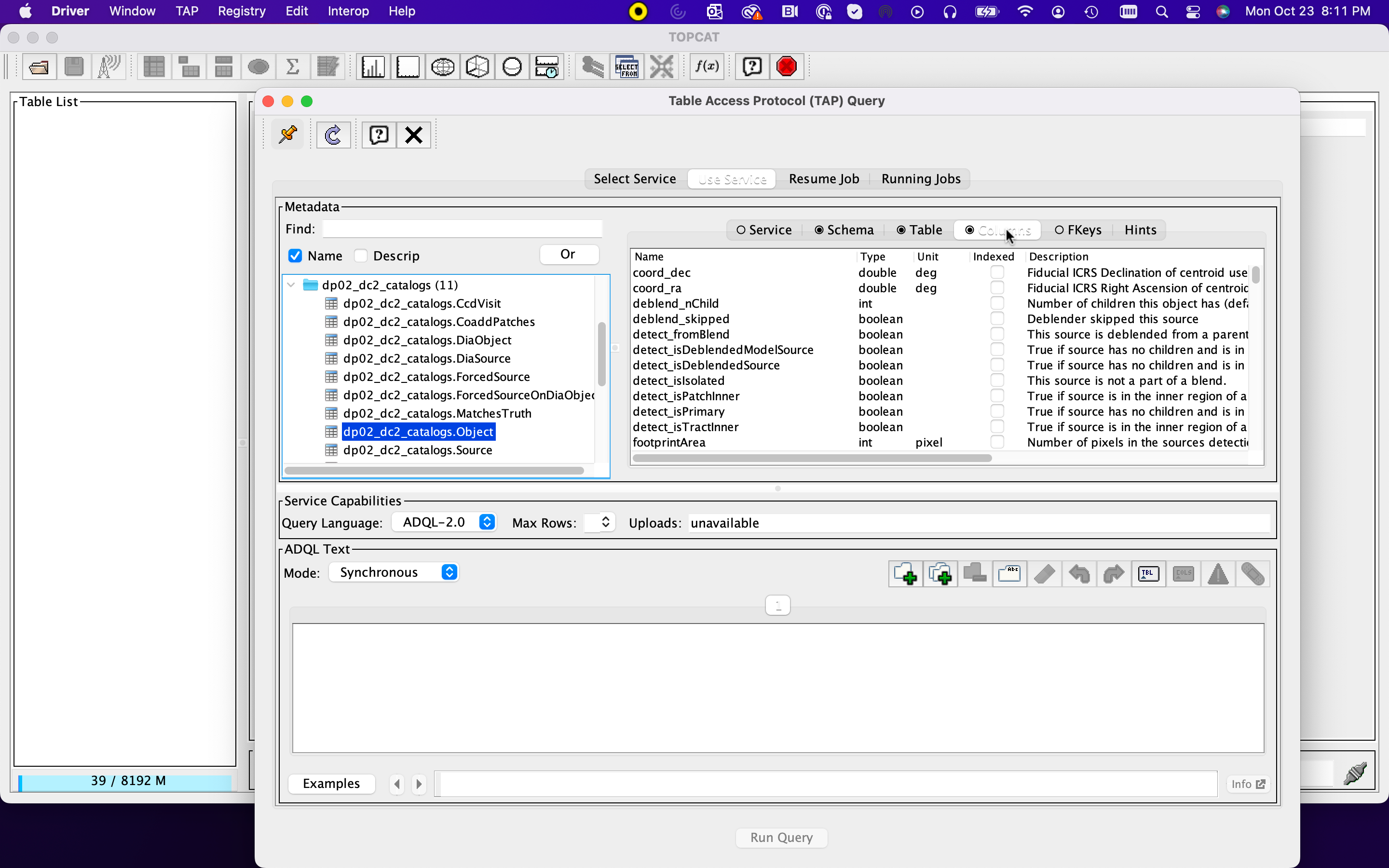
Figure 1: The Table Access Protocol (TAP) Query window with the main TOPCAT window in the background.
1.2. Prepare a simple ADQL spatial query to return a small set of values from the
dp02_dc2_catalogs.Object table. Specifically, create an ADQL query that returns
coord_ra, coord_dec, detect_isPrimary, r_calibFlux, r_cModelFlux,
and r_extendedness for the first 10 dp02_dc2_catalogs.Object entries found
within a 0.1-degree radius circle centered at (RA,DEC)=(62,-37), which is near the
center of the DP0.2 sky projection.
SELECT TOP 10
        coord_ra, coord_dec, detect_isPrimary,
        r_calibFlux, r_cModelFlux, r_extendedness
FROM dp02_dc2_catalogs.Object
WHERE CONTAINS(POINT('ICRS', coord_ra, coord_dec),
                CIRCLE('ICRS', 62, -37, 0.1)) = 1
1.3. Copy and paste the above query into the “ADQL Text” panel of the “Table Access Protocol (TAP) Query” window, and then click the “Run Query” button at the bottom of this window.
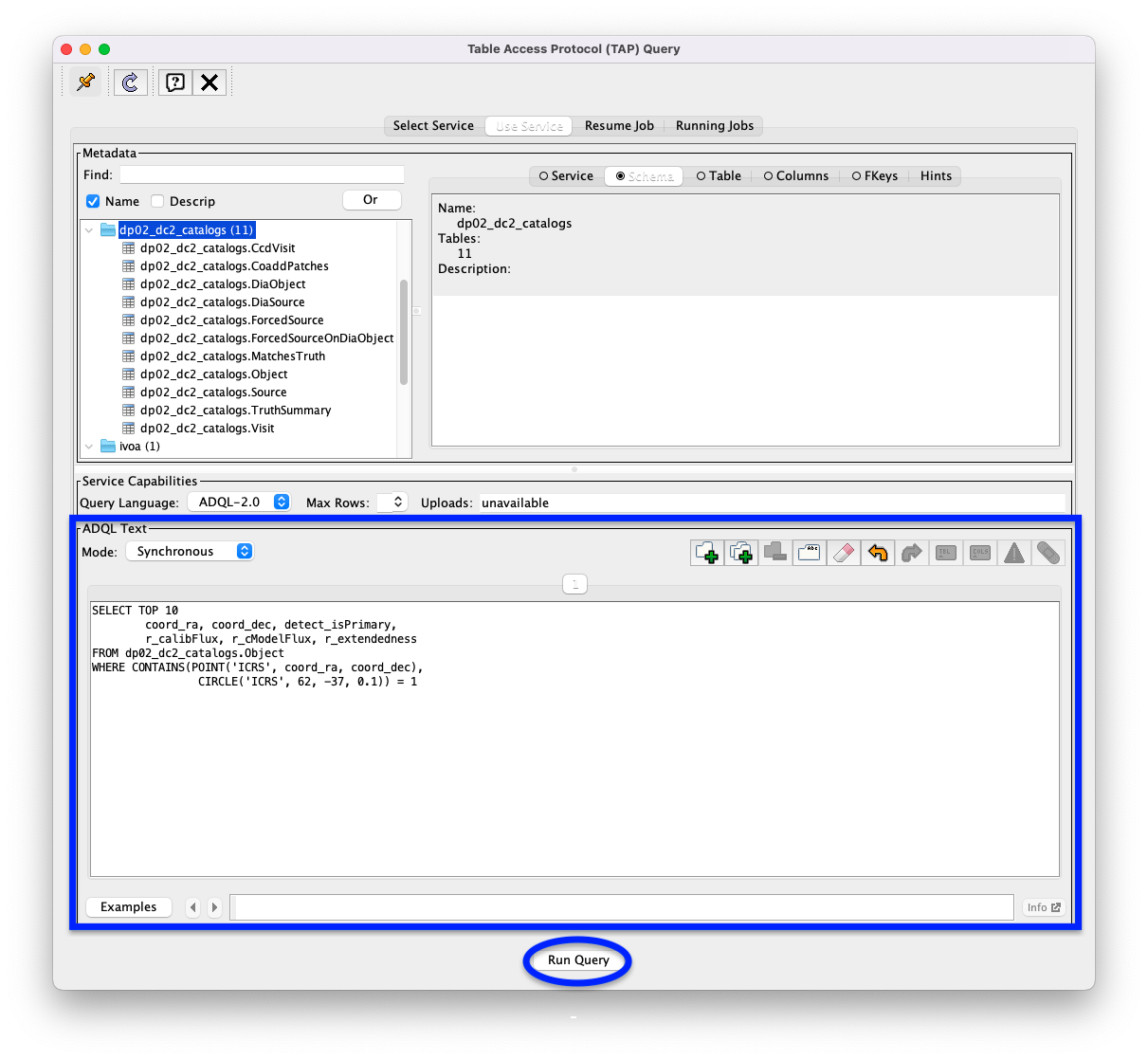
Figure 2: The Table Access Protocol (TAP) Query window with the ADQL query from Step 1.2 entered into its ADQL Text panel. The ADQL Text panel and the “Run Query” button are highlighted with a blue rectangle and a blue oval, respectively.
1.4. Find the table of results in the “Table List” panel of the main TOPCAT window, and then click on the “Display table cell data” icon. It is the 4th icon from the left in the row of icons at the top of the main TOPCAT window (it looks like a table with the first row and first column grayed out).
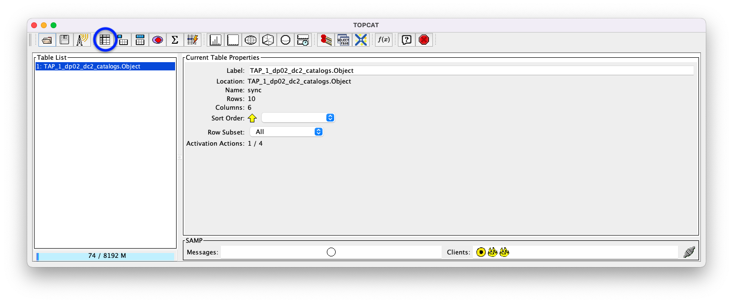
Figure 3: The main TOPCAT window with the newly created table – which is holding the results from the ADQL – highlighted in blue in the Table List panel. The “Display table cell data” icon is indicated by a blue circle.
1.5. View the contents of the TOPCAT Table Browser window that has opened. For this simple query, there are only 10 entries; the whole content of this table is visible. For larger tables, vertical and horizontal scrollbars appear that permit viewing other parts of the table.
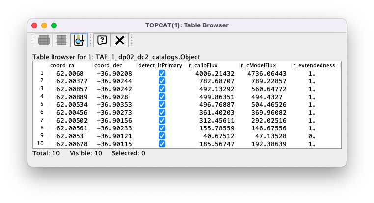
Figure 4: he Table Browser Window, showing the contents of the newly created table.
Example 2. Run a more detailed query
The main goal of this example is to create a simple color-magnitude diagram for the 10000 bright point sources
(mostly stars) returned from a TAP server query of the DP0.2 dp02_dc2_catalogs.Object table. This will
involve creating new columns based on the columns returned by the query, as well as learning some basic TOPCAT
plotting routines.
2.1. Delete the ADQL in the “ADQL Text” panel from Example 1, replace it with the following
ADQL, and click the “Run Query” button. This query will return the coord_ra, coord_dec,
and the (u,g,r,i,z,y) calibFlux and calibFluxErr columns for the top 10000 entries returned from
the dp02_dc2_catalogs.Object table for bright (>360 nJy; which corresponds to about 25 mag),
non-extended (star-like) primary objects within 1 degree of (RA,DEC)=(62,-37).
SELECT coord_ra, coord_dec,
       u_calibFlux, u_calibFluxErr, g_calibFlux, g_calibFluxErr,
       r_calibFlux, r_calibFluxErr, i_calibFlux, i_calibFluxErr,
       z_calibFlux, z_calibFluxErr, y_calibFlux, y_calibFluxErr
FROM dp02_dc2_catalogs.Object
WHERE CONTAINS(POINT('ICRS', coord_ra, coord_dec),
                CIRCLE('ICRS', 62, -37, 1.0)) = 1
      AND detect_isPrimary = 1
      AND u_calibFlux > 360 AND g_calibFlux > 360
      AND r_calibFlux > 360 AND i_calibFlux > 360
      AND z_calibFlux > 360 AND y_calibFlux > 360
      AND u_extendedness = 0 AND g_extendedness = 0
      AND r_extendedness = 0 AND i_extendedness = 0
      AND z_extendedness = 0 AND y_extendedness = 0
2.2. This is a longer query than the previous one. While the query is running, this temporary TOPCAT “Load New Table” window will pop up. (It will close once the query completes.)
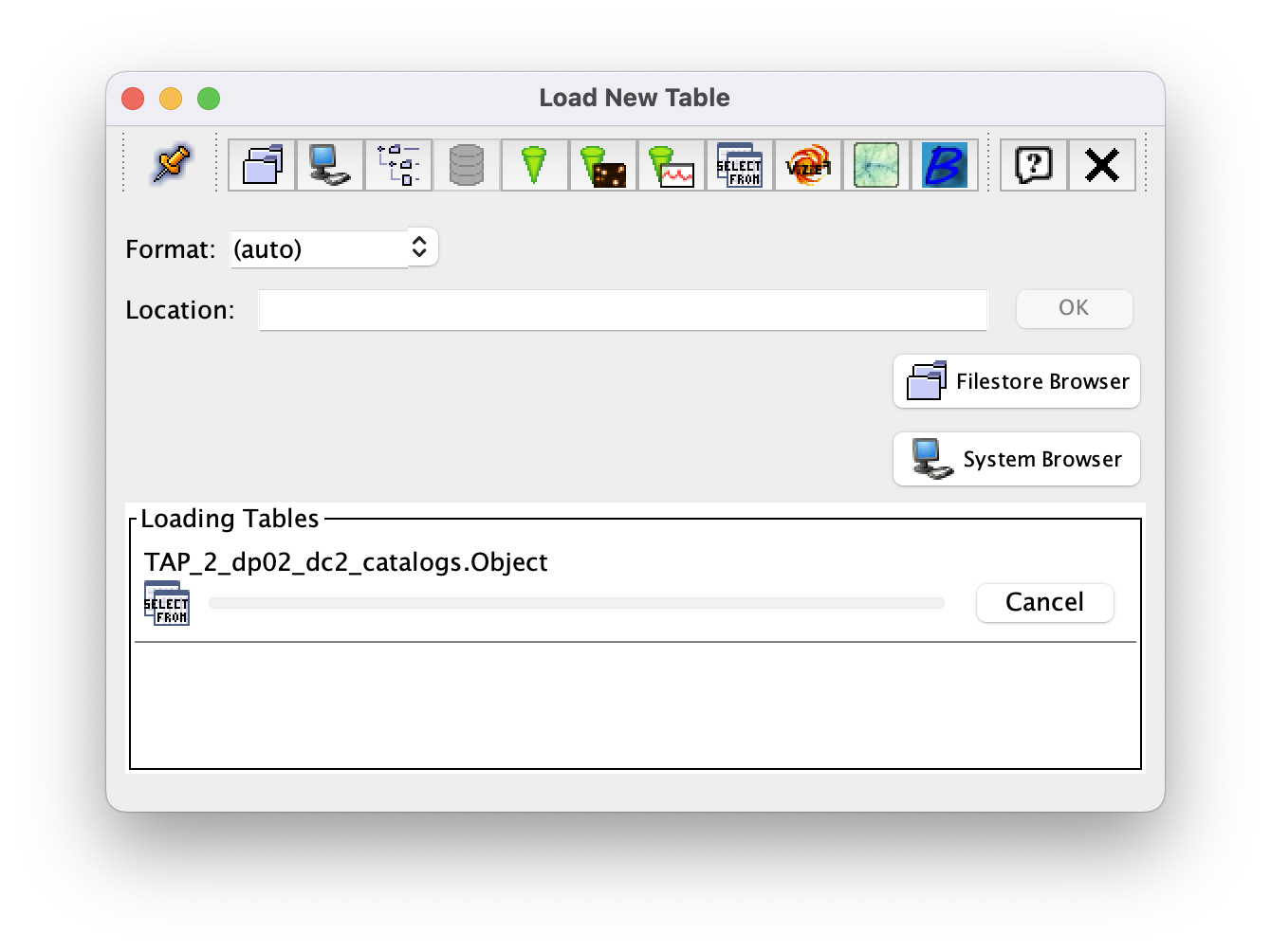
Figure 5: The “Load New Table” window. It will open automatically while the query is running and close when the query finishes.
2.3. Note that, once the query completes, there is a second table in the “Table List” panel of the main TOPCAT window. Now, ensure that the new table is highlighted in the “Table List” panel, and, like in Step 1.4 of Example 1, click on the “Display table cell data” icon.
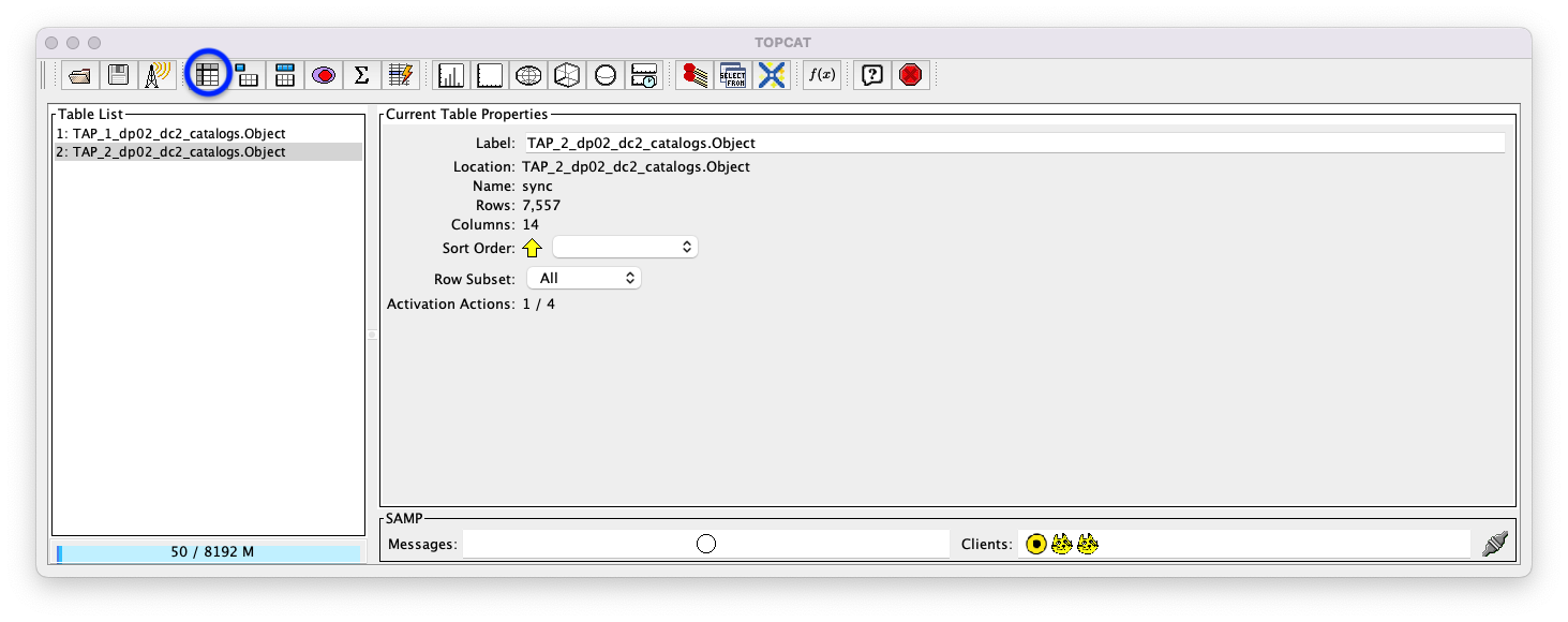
Figure 6: The main TOPCAT window with the newly created table highlighted in gray in the Table List panel. The “Display table cell data” icon is indicated by a blue circle.
2.4. View the contents of the TOPCAT Table Browser window that has opened. Unlike the table from Example 1, this is a large table, and there are both horizontal and vertical scrollbars to permit the user to scroll to other parts of the table.
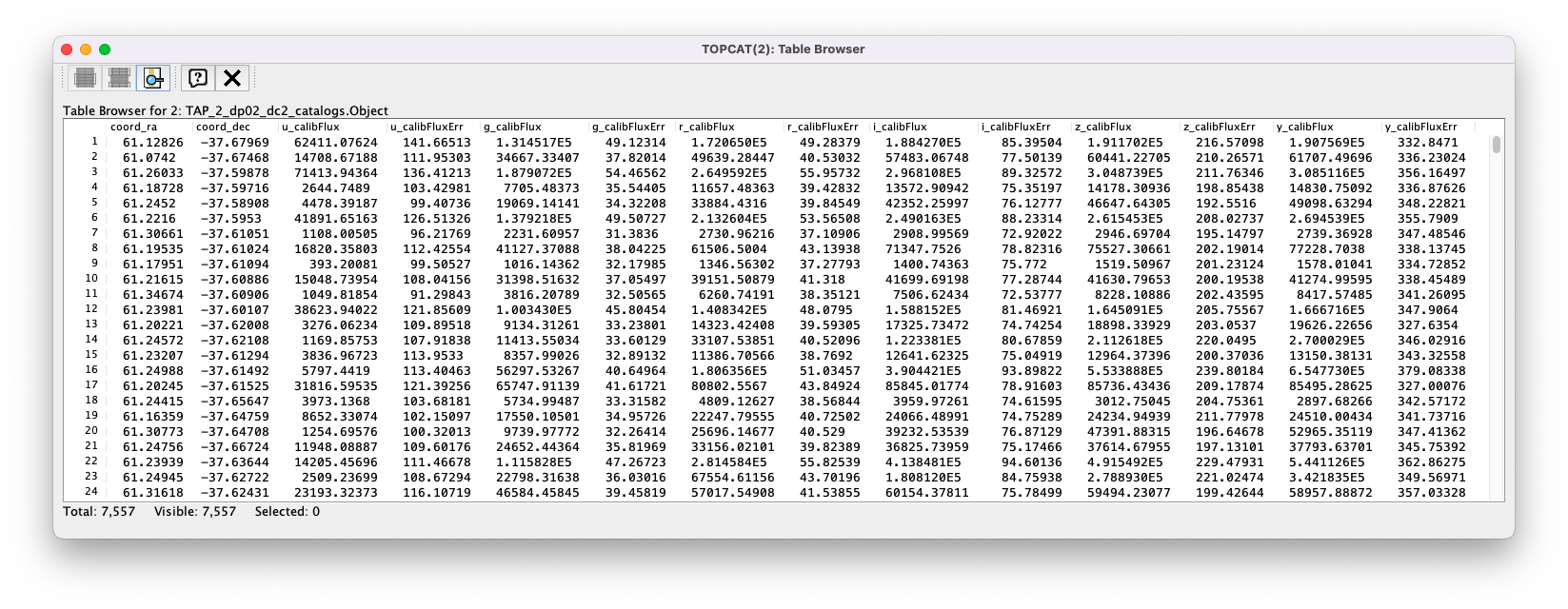
Figure 7: The Table Browser Window, showing the contents of the newly created table.
2.5. Click on the “Display column metadata” icon – the 6th icon from the left in the row of icons at the top of the main TOPCAT window (it looks like a table with the first row highlighted in blue). This will open up a “Table Columns” window.
Figure 8: The main TOPCAT window with the “Display column metadata” icon circled in blue.
2.6. Note the content of the “Table Columns” window. Each table column is listed, along with various information about that column – e.g., its name, the class and datatype of its contents, its units (if any), and its description (if any).
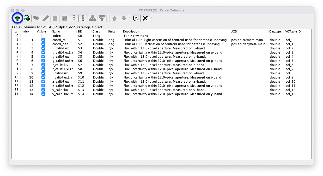
Figure 9: The “Table Columns” window. The “Add column” icon – which will be used in the next step – is circled in blue.
2.7. Create a new column for the u-band AB magnitude. (Note that the AB Magnitudes Wikipedia page provides a concise resource for users who are unfamiliar with the AB magnitude system.)
Click on the “Add column” icon – the big green plus (“+”) sign that is the left-most icon in the top row of the Table Columns window from the previous step. This will open a “Define Synthetic Column” window.
Insert
u_calibMagfor the “Name” in the “Define Synthetic Column” window.Insert the following equation – which converts fluxes in nanojanskys to AB magnitudes – for the “Expression” in the “Define Synthetic Column” window.
-2.5*log10(u_calibFlux) + 31.4
(Optional) Use the built-in function to convert, e.g.,
janskyToAb(r_calibFlux*1e-9). Note that the factor of1e-9is needed because the fluxes are in units of nJy but Jy are expected by the function.(Optional) Insert
magfor the “Units” in the “Define Synthetic Column” window.(Optional) Insert
Apparent magnitude within 12.0-pixel aperture. Measured on u-band.for the “Description” in the “Define Synthetic Column” window.Click the “OK” button on the “Define Synthetic Column” window.
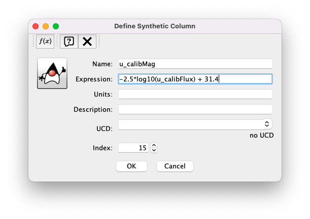
Figure 10: The “Define Synthetic Column” window filled out for creating a u-band AB magnitude column.
2.8. Create a new column for the error in the u-band AB magnitude. Recall that magnitudes are are logarithmic quantities. For relatively small errors (less than about 10%) one can perform the propagation-of-errors analysis to find \(\sigma_\mathrm{mag} = (2.5/\ln(10.)) \times ( \sigma_\mathrm{flux} / \mathrm{flux} )\), which can be approximated as \(\sigma_\mathrm{mag} = 1.086 \times ( \sigma_\mathrm{flux} / \mathrm{flux} )\).
Insert
u_calibMagErrfor the “Name” in the “Define Synthetic Column” window.Insert the following equation – which converts relative errors in flux to errors in magnitudes – for the “Expression” in the “Define Synthetic Column” window.
1.086*(u_calibFluxErr/u_calibFlux)
(Optional) Insert
magfor the “Units” in the “Define Synthetic Column” window.(Optional) Insert
Error in the apparent magnitude within 12.0-pixel aperture. Measured on u-band.for the “Description” in the “Define Synthetic Column” window.Click the “OK” button on the “Define Synthetic Column” window.

Figure 11: The “Define Synthetic Column” window filled out for creating a u-band AB magnitude error column.
2.9. Note that each time a column is added, a column will appear in the “Table Columns” window.
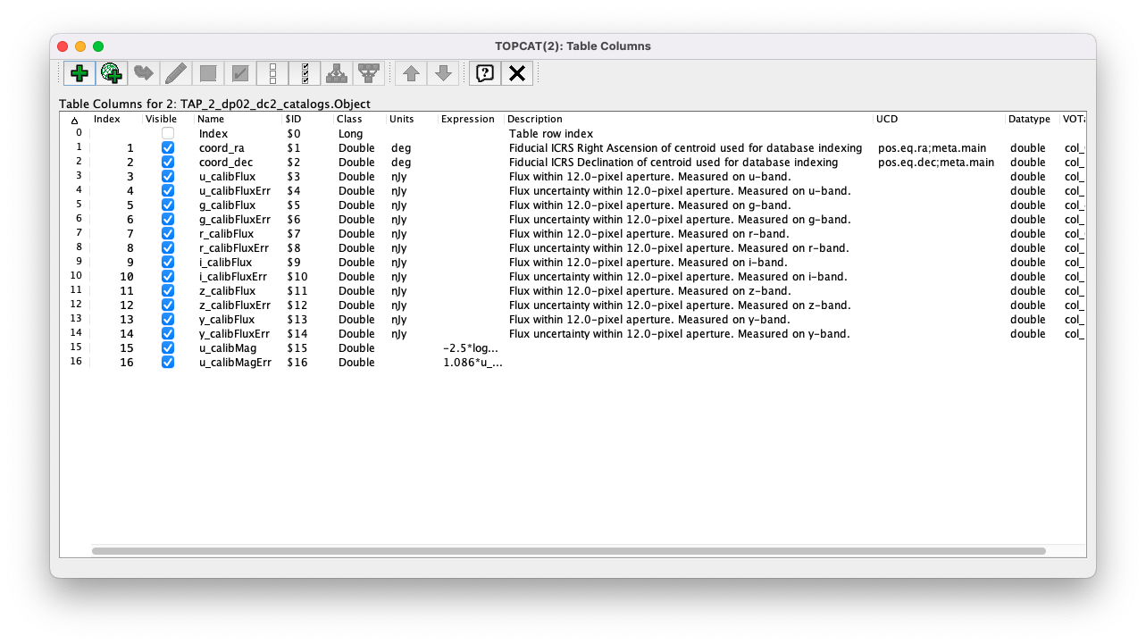
Figure 12: The “Table Columns” window showing the new columns, u_calibMag and u_calibMagErr, at the bottom of the table column list.
2.10. Repeat Steps 2.6 and 2.7 for the other filter bands (g,r,i,z,y). After doing so, entries for all of these new columns will appear in the Table Columns window. For convenience, here are “copy-and-paste” versions of the equations for the AB magnitude and the AB magnitude error for each of the filter bands. For a more advanced approach, scroll down to the bottom of the page to Exercises for the learner and find an example of how to retrieve fluxes as magnitudes and avoid the need to add columns.
-2.5*log10(g_calibFlux) + 31.4
-2.5*log10(r_calibFlux) + 31.4
-2.5*log10(i_calibFlux) + 31.4
-2.5*log10(z_calibFlux) + 31.4
-2.5*log10(y_calibFlux) + 31.4
1.086*(g_calibFluxErr/g_calibFlux)
1.086*(r_calibFluxErr/r_calibFlux)
1.086*(i_calibFluxErr/i_calibFlux)
1.086*(z_calibFluxErr/z_calibFlux)
1.086*(y_calibFluxErr/y_calibFlux)
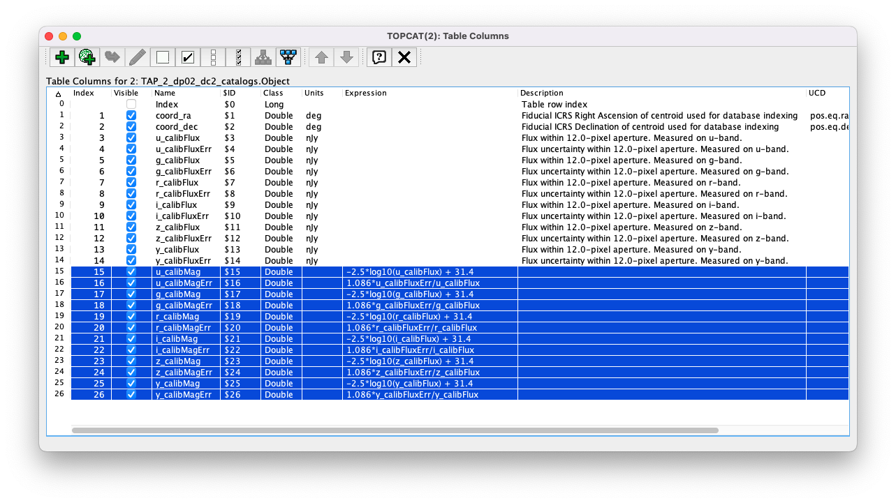
Figure 13: The “Table Columns” window showing all the new columns at the bottom of the table column list. The new columns are highlighted in blue.
2.11. Click on the “Display table cell data” icon in the main TOPCAT window (as in Step 2.3 above). The values for the new columns are now tabulated within the Table Browser along with the values from the original columns.
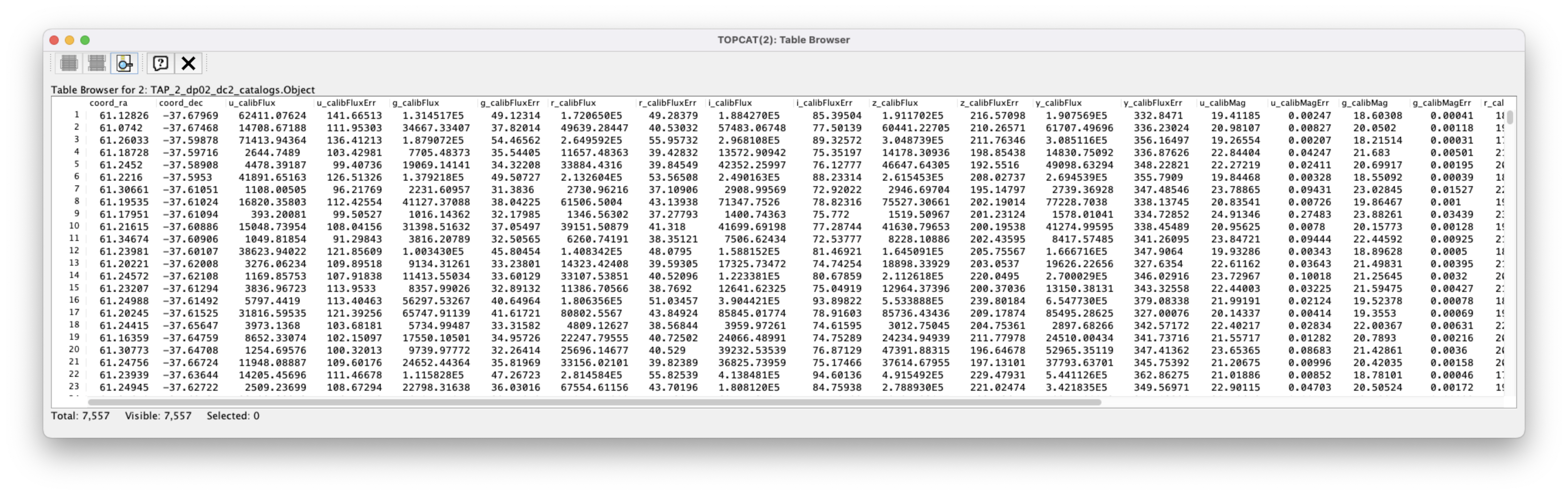
Figure 14: The Table Browser Window, showing the contents of the Example 2 table, including for the columns just created.
2.12. Return to the main TOPCAT window, ensure the table returned by the Example 2 query is highlighted in the “Table List” panel, and click on the “Plane plotting window” icon – the 11th icon from the left in the row of icons at the top of the main TOPCAT window (it looks like a blank X/Y plot).
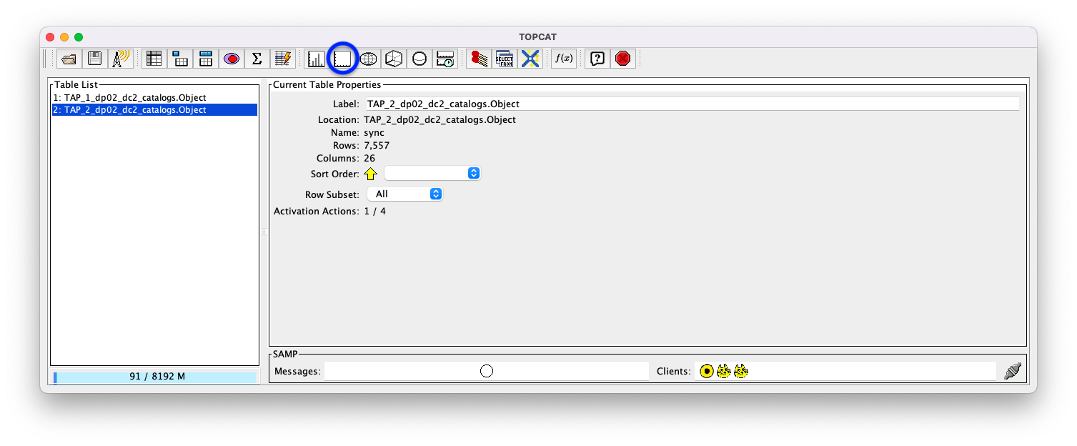
Figure 15: The main TOPCAT window with the “Plane plotting window” icon circled in blue.
2.13. Note that TOPCAT has returned with a Plane Plot window, initially
plotting the first 2 numerical columns from the table. In this case, these
two columns are coord_ra and coord_dec; so the plot serves as a basic
sky plot.
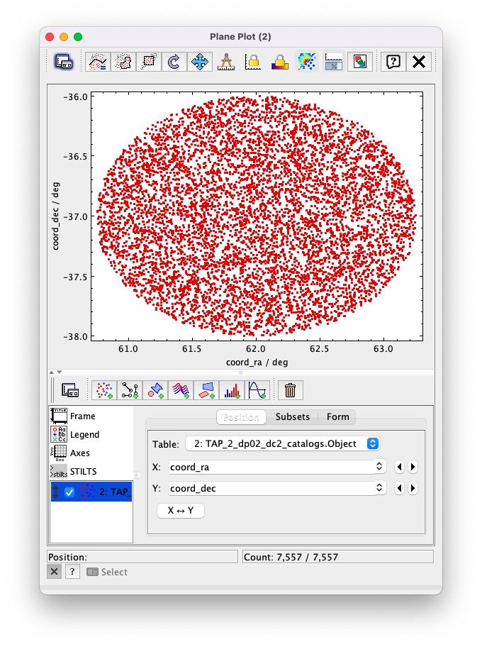
Figure 16: The Plane Plot window, plotting coord_dec vs. coord_ra for the 10000
star-like objects returned by the Example 2 ADQL query.
2.14. Replace coord_ra and coord_dec with r_calibMag - i_calibMag and g_calibMag
in the “X” and “Y” windows, respectively. For convenience, here are “copy-and-paste” versions
of these two coordinate expressions.
r_calibMag - i_calibMag
g_calibMag
2.15. Examine the g_calibMag vs. r_calibMag - i_calibMag color magnitude diagram
produced for this set of stars (and star-like objects).
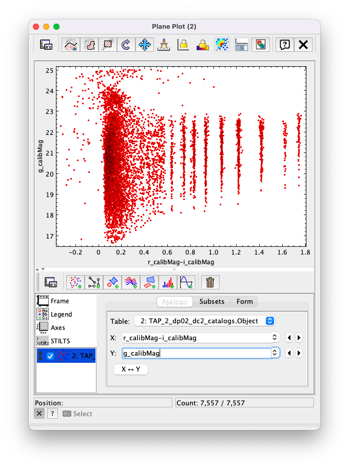
Figure 17: The Plane Plot window, plotting g_calibMag vs. r_calibMag - i_calibMag for the 10000
star-like objects returned by the Example 2 ADQL query. (The “quantized” colors for objects
with r_calibMag - i_calibMag > 0.6 are an artifact of the simulation upon which DP0.2 is based.)
2.16. Astronomers usually prefer to plot their color-magnitude diagrams with brighter (lower magnitude)
objects at the top of the plot and fainter (higher magnitude) objects at the bottom. To adjust the plot to follow
this convention, click on the “Axes” button in the lower-left panel of the “Plane Plot” window to flip the Y axis.
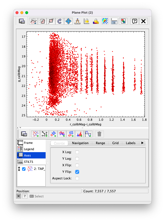
Figure 18: Same as previous plot, but with the y-axis flipped.
2.17. Finally, to guide the eye, add a grid to the plot. To do so, click on the “Grid” button at the top of the bottom-right panel of the “Plane Plot” window and check the “Draw Grid” option.
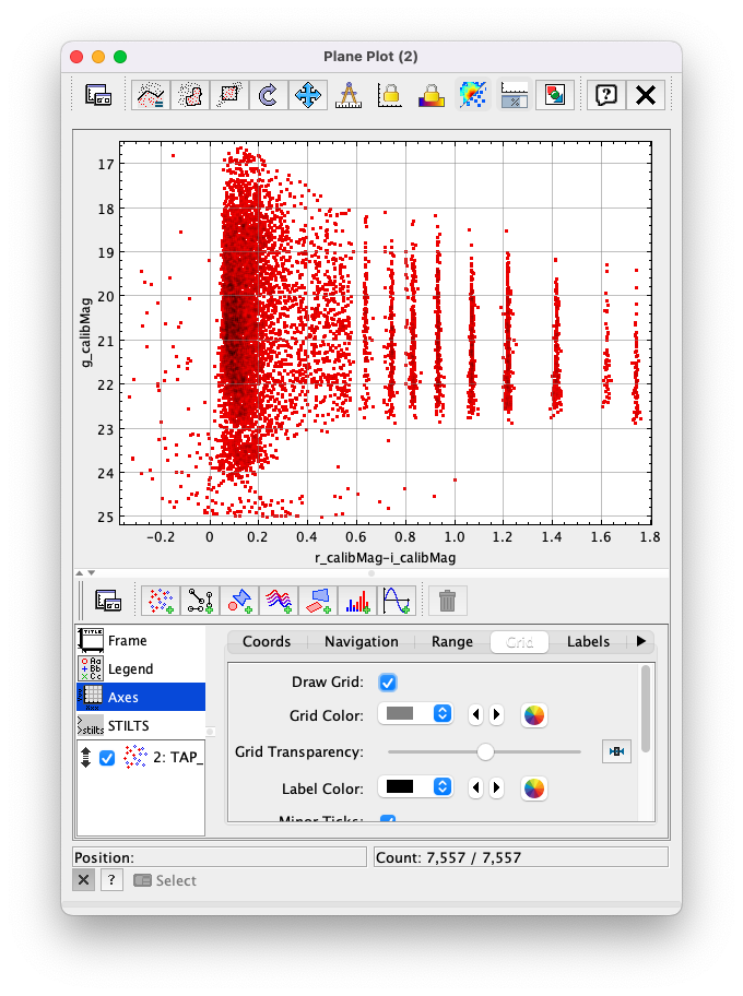
Figure 19: Same as previous plot, but with a grid added.
2.18. (Optional) Explore! For example, try plotting the color magnitude diagrams for other
filter passbands. How does the u_calibMag vs. r_calibMag - i_calibMag color magnitude diagram
compare with the g_calibMag vs. r_calibMag - i_calibMag? How about the g_calibMag vs. z_calibMag - y_calibMag?
color magnitude diagram?
Example 3. Interact with multiple plots from the same table
A strength of TOPCAT is that the data from a given table are linked across the plots based on that table. The current example example investigates this feature by looking at multiple plots for the table of results returned by the ADQL query from Example 2. One of these plots will be the color-magnitude diagram produced in Example 2. Two other plots will also be generated from that same table.
3.1. If not already done, run through Example 2. Keep the Table Browser window (from Step 2.11) and the g_calibMag vs.
r_calibMag - i_calibMag color magnitude diagram Sky Plot window (from Step 2.17) open.
3.2. Create a skyplot of the RA,DEC positions of the stars returned by the query. To do so, go to the main TOPCAT window, ensure that the table from the Example 2 query is highlighted in the “Table List” panel, and click on the “Sky plotting window” icon – the 12th icon from the left in the row of icons at the top of the main TOPCAT window (it looks like a small, gridded Aitoff map projection).

Figure 20: The main TOPCAT window. The “Sky plotting window” icon is circled in blue.
3.3. Note the Sky Plot window that TOPCAT returns.
TOPCAT is generally pretty good at identifying which columns in
a table represent (RA, DEC) coordinates, and it succeeds
in this case, plotting coord_ra and coord_dec as the
RA and the DEC, respectively. Note that TOPCAT automatically
adjusts to an appropriate RA, DEC range, but the plot can be
zoomed in and out interactively via the mouse or scroll wheel.
Also note that TOPCAT plots the grid by default in sexagesimal
units, but these (and other aspects of the plot) can be modified
using the Axes button in the lower left panel of the Sky Plot window.
Keep this Sky Plot window open for later steps in this example.
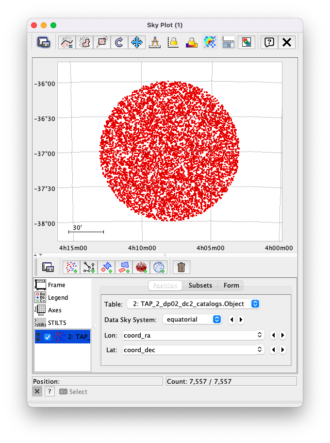
Figure 21: The Skyplot window, showing the sky positions in (sexagesimal) equatorial coordindates for the entries returned by the Example 2 ADQL query.
3.4. Create a Plane Plot of the estimated error in the g-band AB magnitude (g_calibMagErr) vs. the g-band AB magnitude itself (g_calibMag).
Ensure the table returned by the Example 2 query is highlighted in the “Table List” panel of the main TOPCAT window, and click on the “Plane plotting window” icon.
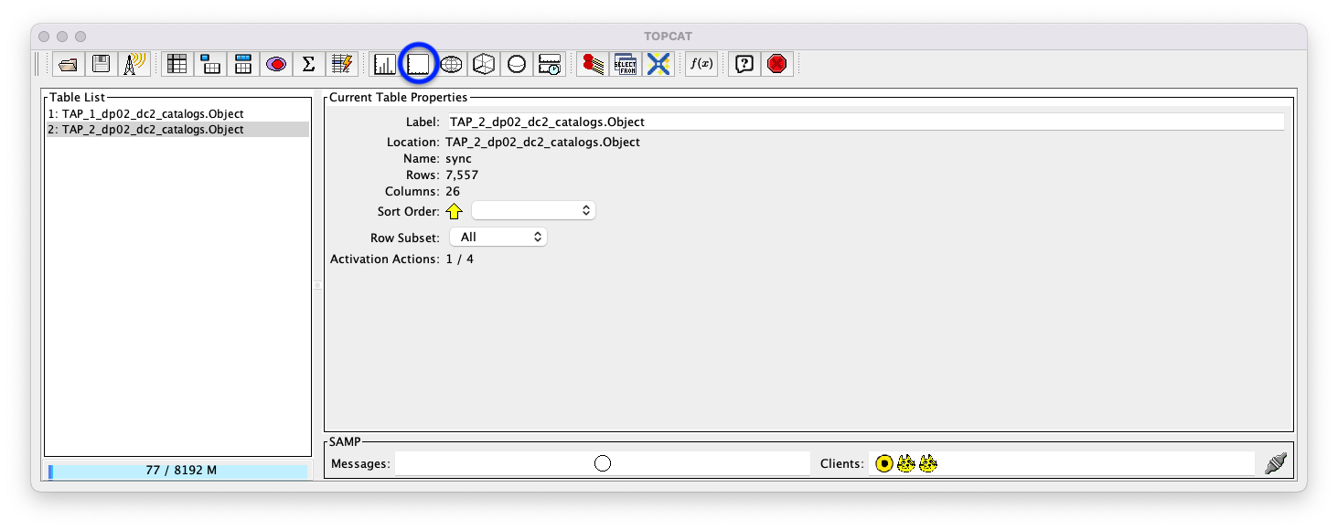
Figure 22: The main TOPCAT window. The “Plane plotting window” icon is circled in blue.
Replace the column names in the “X” and “Y” windows in the lower-right panel of the “Plane Plot” window with
g_calibMagandg_calibMagErr, respectively, and add a grid to the plot (as described in Step 2.17). Keep this Plane Plot window open for the steps in this example.
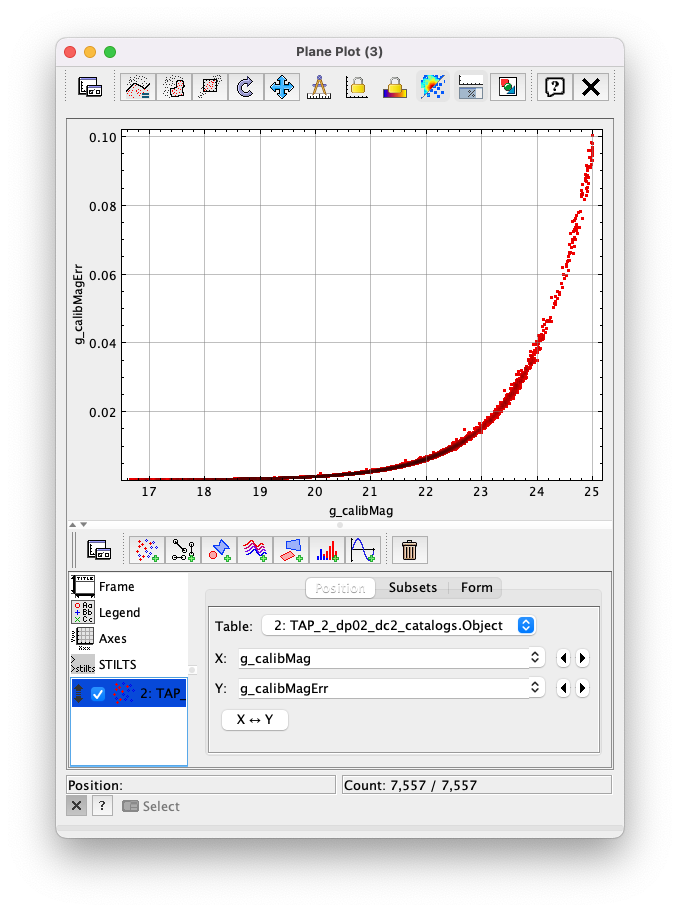
Figure 23: The “Plane Plot” window, showing g_calibMagErr plotted against g_calibMag.
3.5. Look at all 3 plots together – the one “Sky Plot” and the 2 “Plane Plots” – plus the “Table Browser”.
Using the mouse to “click-and-drag” their corners and edges, the sizes and positions of these windows can be adjusted so they all can be viewed simultaneously.
Click on a symbol in one of the plots. (In the following figure, a point near (
r_calibMag-i_calibMag=1.0,g_calibMag=24.2) was clicked in the color-magnitude plot.) A small black circle with cross-hairs will appear around that particular symbol in that particular plot. In particular, note that a small black circle with cross-hairs will also appear around the symbol for that particular object in the other plots. Its row entry in the the “Table Browser” will also be highlighted.
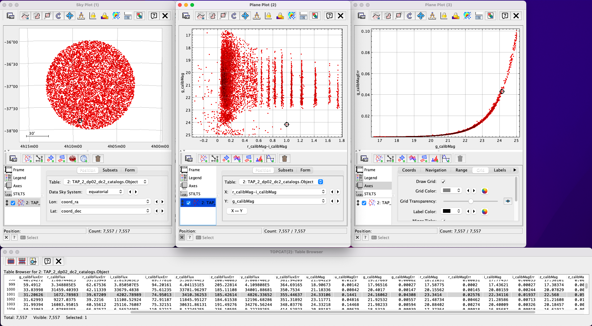
Figure 24: A Sky Plot window, two Plane Plot window, and a Table Browser window displaying data returned from the ADQL query from Example 2. Note the black circle with cross-hairs in the three plot windows and the row highlighted in gray in the Table Browser window: these all refer to the same data point.
3.6. Note that this data linkage works not only for single objects but for subsets of points that one can define for the table via the TOPCAT interface. The interested user is directed to the TOPCAT documentation on defining subsets.
Example 4. Create interactive 3D plots
The final example in this tutorial looks at TOPCAT’s interactive 3D plot functionality. As with Example 3, the table returned from the ADQL query in Example 2 will be used.
4.1. If not already done, run through Example 2, at least through Step 2.10,
where the columns for calibMag and calibMagErr for all the filters are generated.
4.2. Go to the main TOPCAT window, ensure that that the table from the Example 2 query is highlighted in the “Table List” panel, and click on the “3D plotting window using Cartesian coordinates” icon – it is the 13th icon from the left in the top row of the TOPCAT window, and it looks like a 2D rendering of a cube.
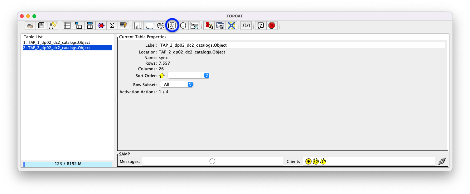
Figure 25: The main TOPCAT window. The “3D plotting window using Cartesian coordinates” icon is circled in blue.
4.3. Note that TOPCAT has opened a “Cube Plot” window, automatically using the first 3
numeric columns of the table – in this case, coord_ra, coord_dec, and
u_calibFlux for the inputs to the “X”, “Y”, and “Z” coordinates, respectively:
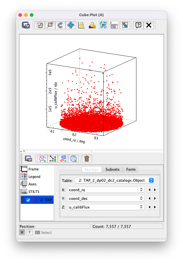
Figure 26: A “Cube Plot” window, plotting coord_ra, coord_dec, and u_calibFlux as the “X”, “Y”, and “Z” coordinates, respectively, for 10000 point sources from Example 2.
4.2. Replace the contents of the “X”, “Y”, and “Z” windows in the lower-right panel of the “Cube
Plot” window with r_calibMag-i_calibMag, g_calibMag-r_calibMag, and u_calibMag-g_calibMag,
respectively. This yields a 3D color-color-color diagram for the 10000 stars (and other point sources)
downloaded in Example 2.
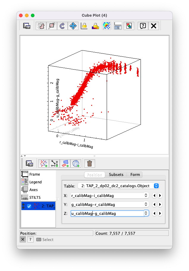
Figure 27: A “Cube Plot” window, plotting the (r-i), (g-r), (u-g) color-color-color diagram for the 10000 point sources from Example 2.
4.3. Add more information to this plot by color-coding the individual symbols.
To do so, click on the “Form” button in the lower-right panel of the “Cube Plot” window; then, in the “Shading” subpanel that appears,
choose “aux” in the “Mode” pull-down menu and insert (for example) i_calibMag in the “Aux” window. This results in a 3D color-color-color
plot with the value of i_calibMag encoded in the color of each symbol. A color bar also appears at the side of the plot.
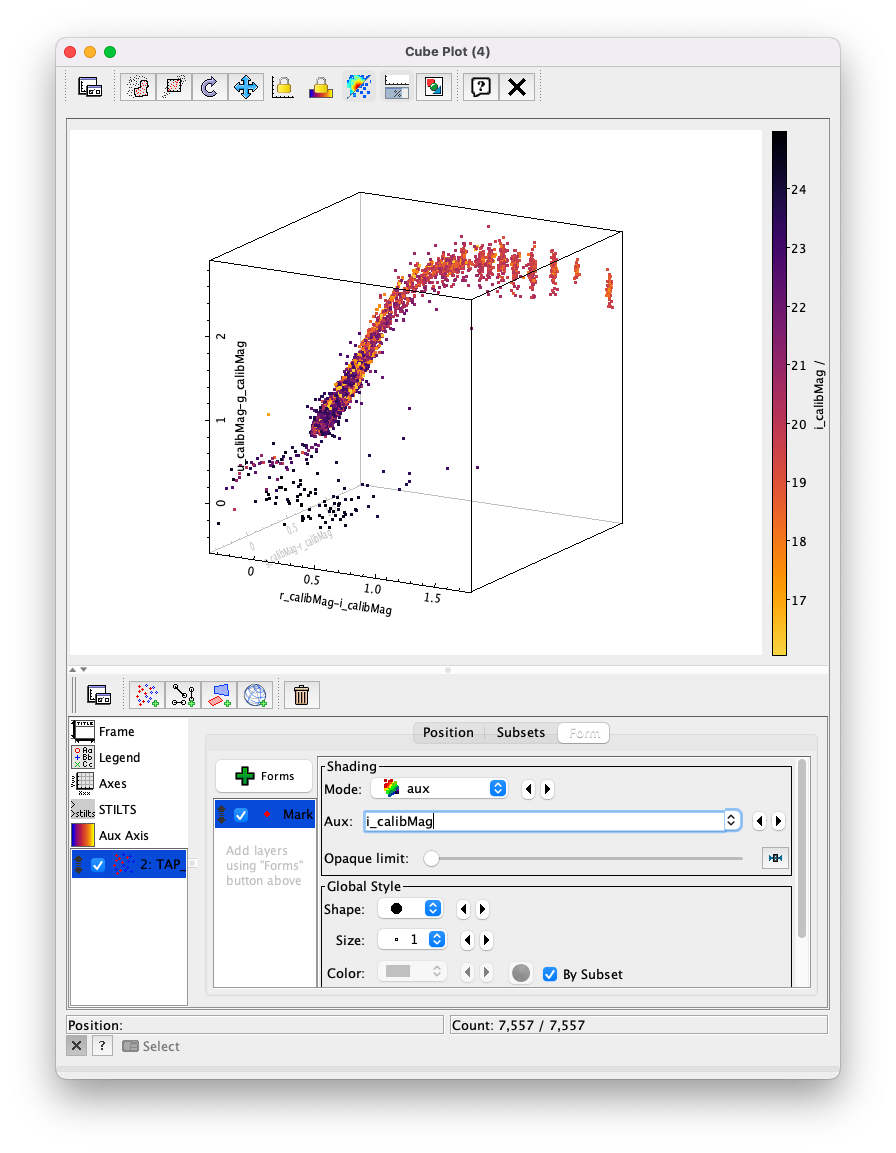
Figure 28: Same as previous plot, but with the symbols color-coded by their value of i_calibMag.
4.4. Change the color look-up table for the auxiliary axis (color bar). To so, click on “Aux Axis” in the left-lower panel of the Cube Plot window. In the new lower-right panel that appears, choose a different color palette from the “Aux Shader” drop-down menu. In the following case, the “Rainbow” color palette was chosen.
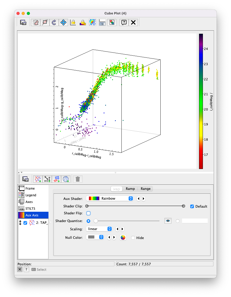
Figure 29: Same as previous plot, but using the “Rainbow” color palette for the auxiliary axis (color bar).
4.5. Test out the interactive functionality of the 3D cube plot. If not already done so, use the mouse to “click-and-drag” a point in the plot window to rotate the plot to a different configuration. Note that, as with the 2D plots, the 3D cube plot can be zoomed in or out using the mouse or a scroll wheel.
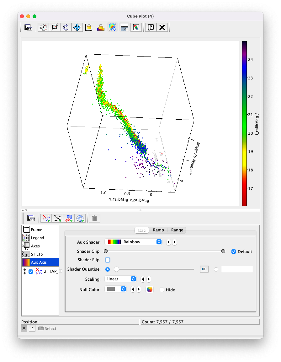
Figure 30: Same as previous plot, but the 3D plot has been rotated about its axes.
4.6. (Optional) Explore! For example, try plotting the equivalent of a color-color-color-color diagram, by using i_calibMag - z_calibMag or z_calibMag - y_calibMag for the auxiliary axis (color bar).
Exercises for the learner
1. Instead of creating the magnitude and magnitude error columns, use the
following query with scisql functions to return fluxes as magnitudes.
SELECT coord_ra, coord_dec,
scisql_nanojanskyToAbMag(u_calibFlux) AS u_calibMag,
scisql_nanojanskyToAbMagSigma(u_calibFlux, u_calibFluxErr) AS u_calibMagErr,
scisql_nanojanskyToAbMag(g_calibFlux) AS g_calibMag,
scisql_nanojanskyToAbMagSigma(g_calibFlux, g_calibFluxErr) AS g_calibMagErr,
scisql_nanojanskyToAbMag(r_calibFlux) AS r_calibMag,
scisql_nanojanskyToAbMagSigma(r_calibFlux, r_calibFluxErr) AS r_calibMagErr,
scisql_nanojanskyToAbMag(i_calibFlux) AS i_calibMag,
scisql_nanojanskyToAbMagSigma(i_calibFlux, i_calibFluxErr) AS i_calibMagErr,
scisql_nanojanskyToAbMag(z_calibFlux) AS z_calibMag,
scisql_nanojanskyToAbMagSigma(z_calibFlux, z_calibFluxErr) AS z_calibMagErr,
scisql_nanojanskyToAbMag(y_calibFlux) AS y_calibMag,
scisql_nanojanskyToAbMagSigma(y_calibFlux, y_calibFluxErr) AS y_calibMagErr
FROM dp02_dc2_catalogs.Object
WHERE CONTAINS(POINT('ICRS', coord_ra, coord_dec),
               CIRCLE('ICRS', 62, -37, 1.0)) = 1
AND detect_isPrimary = 1
AND u_calibFlux > 360 AND g_calibFlux > 360
AND r_calibFlux > 360 AND i_calibFlux > 360
AND z_calibFlux > 360 AND y_calibFlux > 360
AND u_extendedness = 0 AND g_extendedness = 0
AND r_extendedness = 0 AND i_extendedness = 0
AND z_extendedness = 0 AND y_extendedness = 0