01. Bright Stars Color-Magnitude Diagram (beginner)
Contact authors: Melissa Graham and Greg Madejski
Last verified to run: 2022-06-26
Targeted learning level: beginner
Introduction: This tutorial uses the Single-Table Query interface to search for bright stars in a small region of sky, and then uses the Results interface to create a color-magnitude diagram. This is the same demonstration used to illustrate the Table Access Protocol (TAP) service in the first of the Notebook tutorials. Beginner-level users looking for a more general overview of the Portal Aspect should refer to this Introduction to the RSP Portal Aspect.
Step 1. Set the query constraints
1.1. Log in to the Portal Aspect.
1.2. Under “TAP Searches”, leave “1. Select TAP Service” at its default “LSST RSP https://data.lsst.cloud/api/tap”, and leave “2. Select Query Type” at its default “Single Table (UI assisted)”.
1.3. Next to “3. Select Table”, choose the Table Collection to be “dp02_dc2_catalogs” (left drop-down menu) and the Table to be “dp02_dc2_catalogs.Object” (right drop-down menu).
1.4. Under “4. Enter Constraints”, select the box to the left of “Spatial”. Set the “Longitude Column” to “coord_ra”, the “Latitude Column” to “coord_dec”, to match the sky coordinates column names in the Object table. Leave the “Shape Type” as the default “Cone”, and for “Coordinates or Object Name” use the central coordinates of the DC2 simulation area “62, -37”. Next to “Radius”, from the drop down menu choose “degrees” and then enter “1” in the box and press enter to set the search radius to 1 degree.
1.5. In the table at right, under “Output Column Selection and Constraints”, click the box in the left-most column to select “column_names” “coord_ra”, “coord_dec”, “detect_isPrimary”, “g” “r” and “i_calibFlux”, and “g” “r” and “i_extendedness”. Click on the funnel symbol at the top of the checkbox column to filter the table view to show selected columns only.
1.6. In the “constraints” column, enter “=1” for the “detect_isPrimary”, “>360” for the fluxes, and “=0” for the extendedness parameters. This will limit the objects returned to those with no children (i.e., the products of deblending), which are brighter than about 25th magnitude in the g, r, and i filters, and which appear to be point-like (not extended, but not necessarily stellar) in those three filters as well.
At this point the boxes selecting the “extendedness” and “detect_isPrimary” parameters can be unchecked, because it is not necessary for this tutorial to actually retrieve the data in those columns, only to constrain the query based on their values.
Notice: At this point, with the query all set up, clicking “Populate and Edit ADQL” will switch the Query Type to “Edit ADQL (advanced)” and populate the ADQL query box, as shown in Step 3 below.
1.7. Set the “Row Limit” to 10000, to only retrieve 10000 objects for this demonstration.
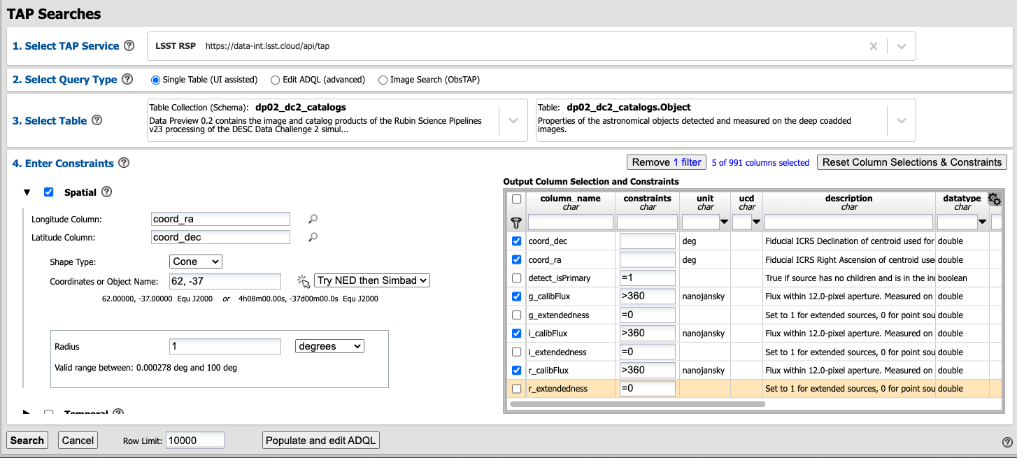
The above screenshot shows the constraints before clicking “Search”.
1.8. Click “Search” at lower left.
Step 2. Create the color-magnitude diagram
The default Results view shows a sky-image at upper left (with the coordinates of returned objects marked on it), a xy table at upper right, and a table of the results values along the bottom. At the time this tutorial was created, the sky-image was still 2MASS and not a DC2 simulated image, so this tutorial does not involve use of the sky-image.
2.1. In the upper left corner, click “xy-tbl” to show only the default xy plot along the top (in this case, plotting the two sky coordinates columns), and the table along the bottom of the screen.
Notice: The objects retrieved do not fill in the search area (a 1 degree radius) in the xy plot of “coord_ra” versus “coord_dec”. This is because a row limit of 10000 objects was applied, and the data is partitioned into files by sky coordinate. The query accessed these files until 10000 objects were found (i.e., the query does not find all objects that satisfy the query parameters and then choose 10000 random objects to return).
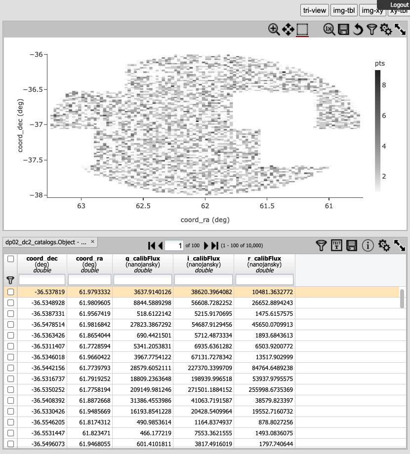
The Results view with “xy-tbl” selected.
Notice: In order to plot color (r-i magnitude) versus magnitude (g), the fluxes (which are in units of nanojansky) are being converted to AB magnitudes in the next step. The AB Magnitudes Wikipedia page provides a concise resource for users who are unfamiliar with AB magnitudes and fluxes in units of janskys.
2.2. Click on the xy plot settings icon (two gears, upper right) in order to “modify trace”, which means to change the plot parameters. Set “X” to be “(-2.5 * log10(r_calibFlux)) - (-2.5 * log10(i_calibFlux))”, and “Y” to be “-2.5 * log10(g_calibFlux) + 31.4”. Leave the color scale and the bins as they are, and click on “Chart Options” to show the options. For “Chart title” enter “Color-Magnitude Diagram”; set “X Label” to “color (r-i)”; set “Y Label” to “magnitude (g)”, and underneath check the “Options” box for “reverse”. Set the “X Min/Max” values to “-0.5” and “2.0”, and the “Y Min/Max” values to “16.5” and “25.5”.
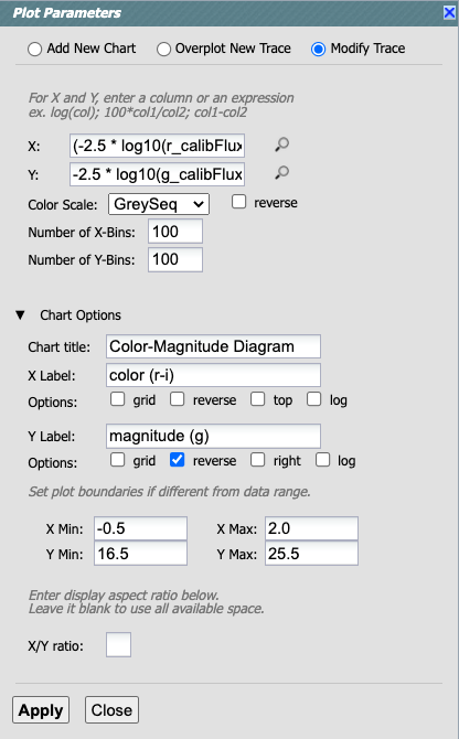
Set the plot parameters.
2.3. Click “Apply” and then “Close” the pop-up window, and look at the color-magnitude plot.
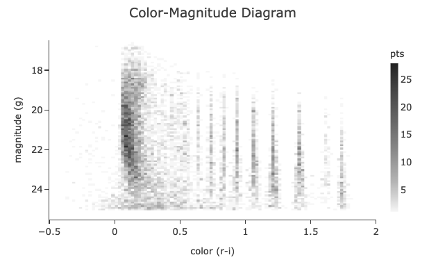
The color-magnitude diagram.
Notice: The default plot style is a a two-dimensional histogram, which is appropriate for very large data sets. In this case, with only 10000 object retrieved, create a scatter plot for comparison.
Notice: The simulated data is visibly quantized in the above plot, and this will not be the case with real data. The discrete sequences at red colors, (g-i) > 0.5, come from the discretized procedure used to simulate low-mass stars in the DP0.2 data set.
2.4. Click on the xy plot settings icon (two gears, upper right) again, but this time choose “Add New Chart”. Leave “Plot Type” at the default, “Scatter”, and then set the “X” and “Y” to the same equation as in Step 2.2. Use the same “Chart Options” except give it a different “Chart title”, such as “Scatter CMD”.
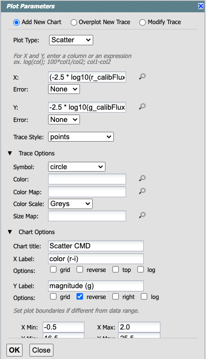
Set the new chart parameters for a scatter plot.
2.5. Click “OK” and “Close”, and look at the new color-magnitude plot.
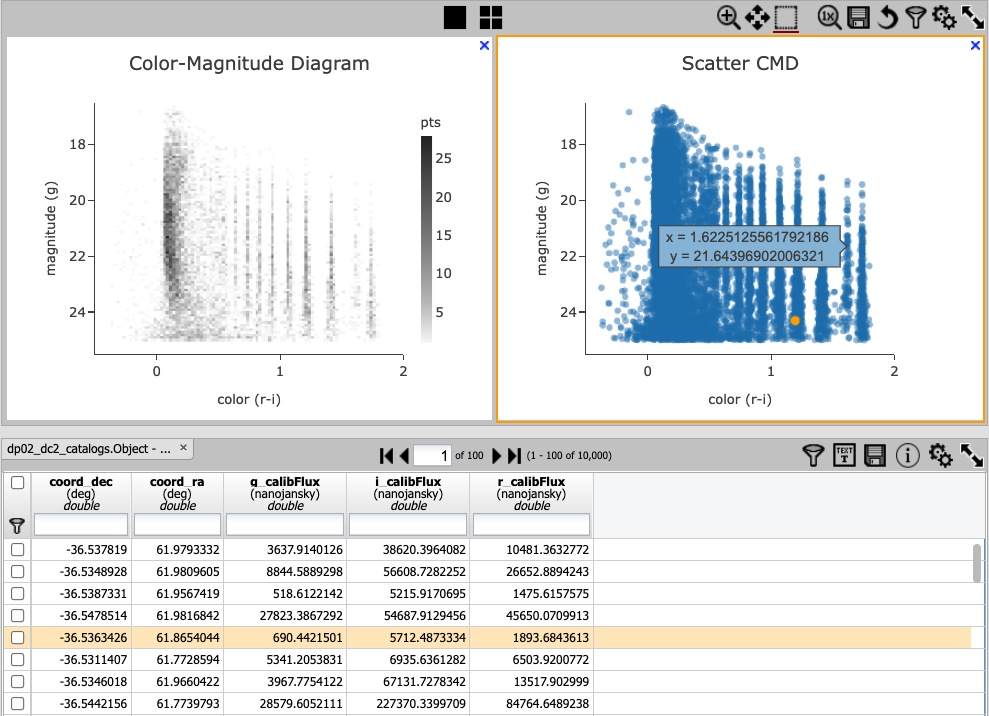
The color-magnitude diagrams, including the new scatter plot (right).
2.6. Interact with the plot. Hover over the data points with a mouse and see the x and y values appear in a pop-up window. Select a row in the table and it appears as a different color in the plot, and vice-versa: select a point in the plot and it is highlighted in the table below.
Step 3. Do the same query with ADQL
3.1. Clear the search results and return to the main Portal interface. Under “2. Select Query Type” select “Edit ADQL (Single Table (UI assisted)”, and enter the following in the box under “ADQL Query”.
SELECT coord_dec,coord_ra,g_calibFlux,i_calibFlux,r_calibFlux
FROM dp02_dc2_catalogs.Object
WHERE detect_isPrimary =1
AND g_calibFlux >360 AND g_extendedness =0
AND i_calibFlux >360 AND i_extendedness =0
AND r_calibFlux >360 AND r_extendedness =0
3.2. Remember to set the “Row Limit” to 10000, and then click “Search” to execute the same query as above. Interact with the results in the same way.