08.1. How to add custom plots to the results active chart
RSP Aspect: Portal
Contact authors: Greg Madejski and Melissa Graham
Last verified to run: 2025-02-04
Targeted learning level: intermediate
Introduction: This tutorial demonstrates how to manipulate the active chart and customize the plotted data in the Portal results tab.
1. Execute a query. Go to the Portal’s DP0.2 Catalogs tab, switch to the ADQL interface, and execute the query below. This query will retrieve a small sample of point-like objects (stars) brighter than 25th magnitude (as in preceding tutorials).
SELECT coord_dec, coord_ra, detect_isPrimary, refExtendedness,
       scisql_nanojanskyToAbMag(u_cModelFlux) AS u_cModelMag,
       scisql_nanojanskyToAbMag(g_cModelFlux) AS g_cModelMag,
       scisql_nanojanskyToAbMag(r_cModelFlux) AS r_cModelMag,
       scisql_nanojanskyToAbMag(i_cModelFlux) AS i_cModelMag,
       scisql_nanojanskyToAbMag(z_cModelFlux) AS z_cModelMag,
       scisql_nanojanskyToAbMag(y_cModelFlux) AS y_cModelMag
FROM dp02_dc2_catalogs.Object
WHERE CONTAINS(POINT('ICRS', coord_ra, coord_dec),
      CIRCLE('ICRS', 62, -37, 0.167)) =1
      AND (detect_isPrimary =1 AND refExtendedness =1
           AND u_cModelFlux >360 AND g_cModelFlux >360
           AND r_cModelFlux >360 AND i_cModelFlux >360
           AND z_cModelFlux >360 AND y_cModelFlux >360)
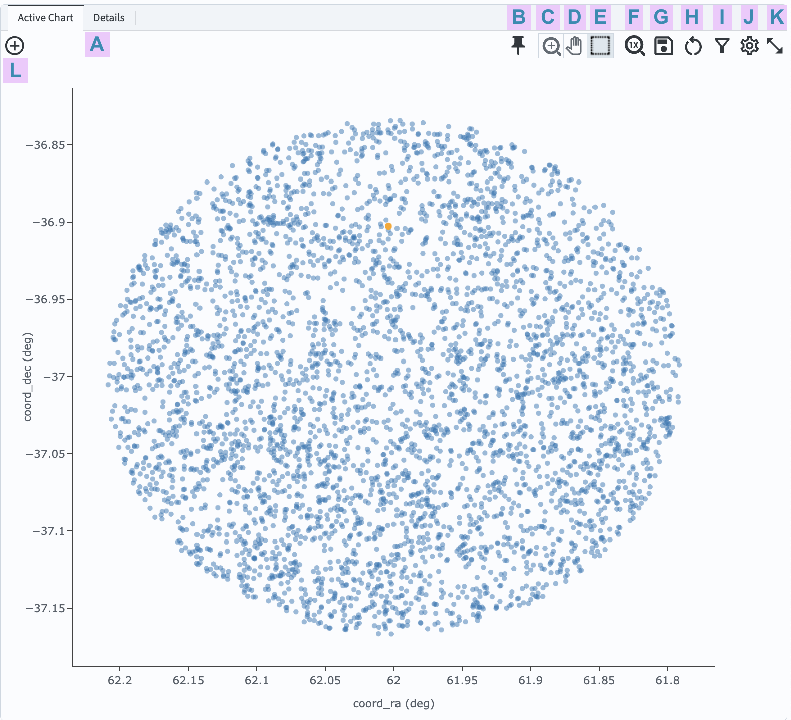
2. View the default active chart (Figure 1). The default plot will use the first two columns of the returned data table (Figure 1).

Figure 1: The active chart panel in the Results tab, with default settings, for the query above.
3. Customize the plot parameters. Click on the settings icon (J in Figure 1) to get the plot parameters pop-up window as seen in Figure 2. Leave the default selection as modify the trace, which means to modify the axes and points in the plot.

Figure 2: The plot parameters pop-up window with adjustments made to generate a color-magnitude diagram.
4. Select data for the x- and y-axis.
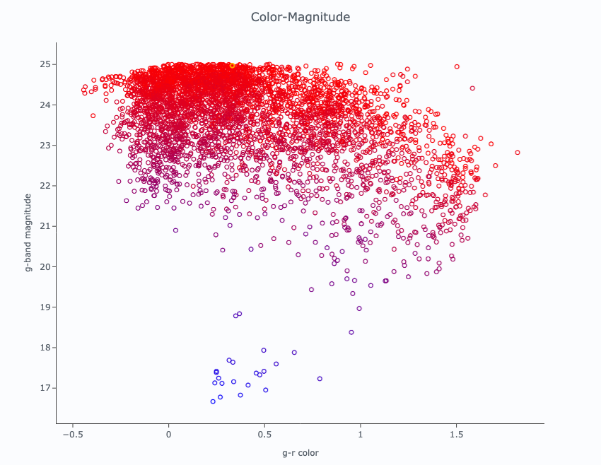
For the X axis enter g_cModelMag - r_cModelMag and for the Y axis enter g_cModelMag, as in the left panel of Figure 2.
5. Select the point type and color (trace options).
As in the center panel of Figure 2, for the symbol type select open circles.
For the symbol color, choose to scale the color by the u_cModelMag column using the “Bluered” color map.
Points that represent objects with bright (faint) u-band magnitudes will be bluer (redder).
6. Label the axes (chart options). As in the right panel of Figure 2, set the chart title to “Color-Magnitude”. Set the X label to “g-r color” and the Y label to “g-band magnitude”.
7. Apply customization. Click “Apply” and then “Close” in the plot parameters window. The plot will now appear as in Figure 3.

Figure 3: The color-magnitude diagram created with steps 3, 4, 5, 6, and 7.
8. Option to save the plot. Click on the save icon (G in Figure 1) to download a PNG file of the plot.
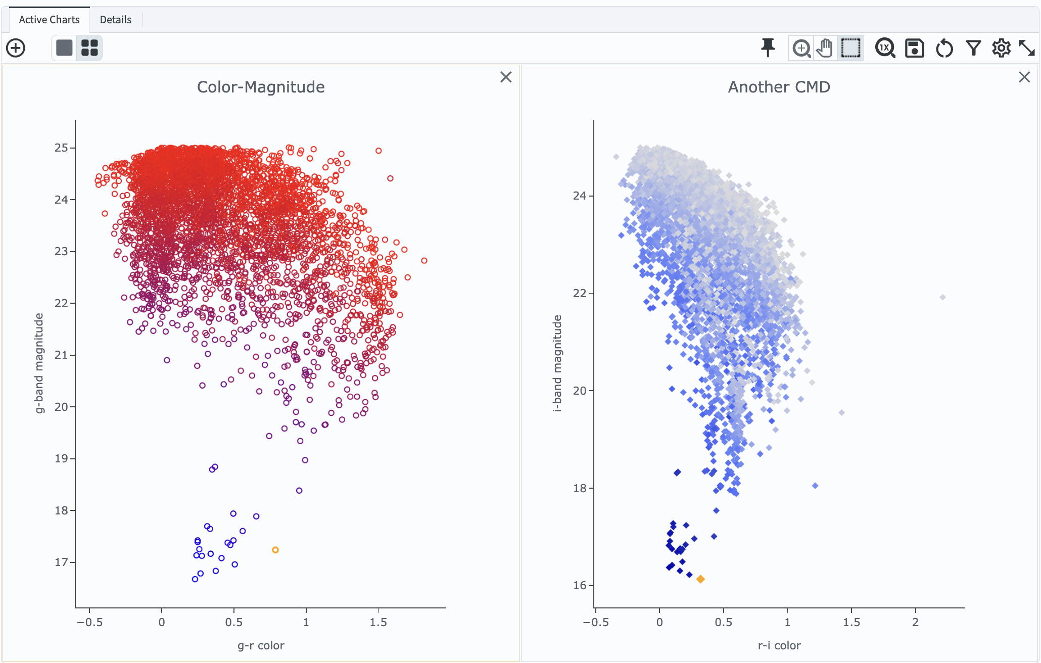
9. Add a second custom chart. Click on the “new chart” icon (L in Figure 1) to get an “Add New Chart” pop-up window. Adjust the plot type, trace, and chart options to create another plot, such as another color-magnitude diagram using different columns, point styles, and axis labels. Then click “OK” and the new plot will appear as a second panel in the active chart region, as in Figure 4.

Figure 4: Additional custom plots added as a new chart will appear next to the first one in the active chart area of the Portal results view.
10. Toggle between tile and single-plot view. At upper left in Figure 4, underneath the tab labelled “Active Charts”, use the single/tiled squares icon to toggle between viewing one/multiple plots at a time.
Warning! After changing the plot settings (e.g., changing which columns are plotted, point symbols and colors), be wary of clicking the restore icon (H in Figure 1) because it entirely resets the plot to the default axes and point style as shown in Figure 1. After zooming in on a plot, to zoom out (reset to default zoom), click the icon under F in Figure 1, not the icon under H.
Return to the list of DP0.2 Portal tutorials.