08. How to use the results active chart (plotted data)
RSP Aspect: Portal
Contact authors: Greg Madejski and Melissa Graham
Last verified to run: 2025-02-04
Targeted learning level: beginner
Introduction: This tutorial demonstrates how to manipulate the active chart and customize the plotted data in the Portal results tab.
Terminology:
ADQL: Astronomy Query Data Language
PNG: Portable Network Graphic
color: The difference in magnitude (brightness) between adjacent bands (e.g., g-r, r-i).
CMD: color-magnitude diagram, a plot with a color on one axis and magnitude on the other.
1. Execute a query. Go to the Portal’s DP0.2 Catalogs tab, switch to the ADQL interface, and execute the query below. This query will retrieve a small sample of point-like objects (stars) brighter than 25th magnitude (as in preceding tutorials).
SELECT coord_dec, coord_ra, detect_isPrimary, refExtendedness,
       scisql_nanojanskyToAbMag(u_cModelFlux) AS u_cModelMag,
       scisql_nanojanskyToAbMag(g_cModelFlux) AS g_cModelMag,
       scisql_nanojanskyToAbMag(r_cModelFlux) AS r_cModelMag,
       scisql_nanojanskyToAbMag(i_cModelFlux) AS i_cModelMag,
       scisql_nanojanskyToAbMag(z_cModelFlux) AS z_cModelMag,
       scisql_nanojanskyToAbMag(y_cModelFlux) AS y_cModelMag
FROM dp02_dc2_catalogs.Object
WHERE CONTAINS(POINT('ICRS', coord_ra, coord_dec),
      CIRCLE('ICRS', 62, -37, 0.167)) =1
      AND (detect_isPrimary =1 AND refExtendedness =1
           AND u_cModelFlux >360 AND g_cModelFlux >360
           AND r_cModelFlux >360 AND i_cModelFlux >360
           AND z_cModelFlux >360 AND y_cModelFlux >360)
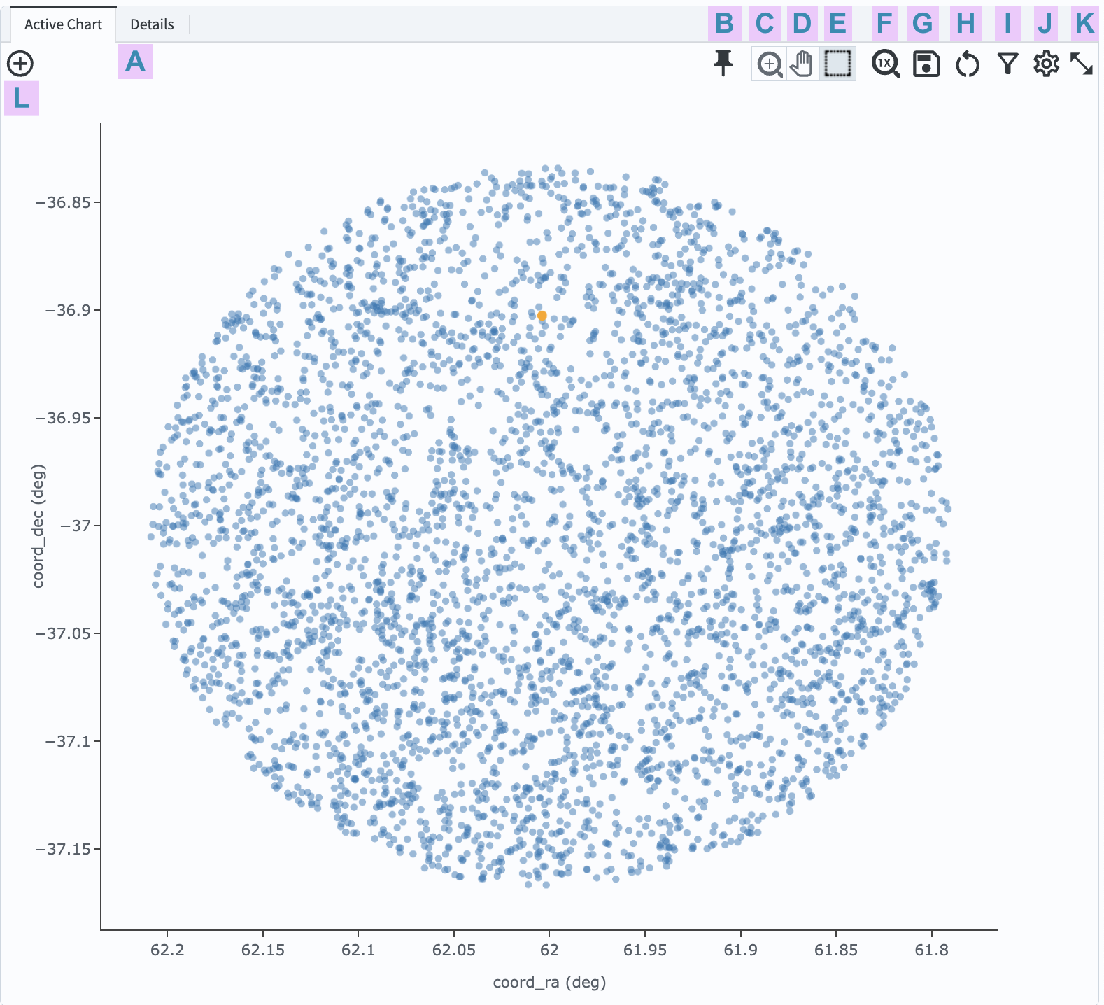
2. View the default active chart (Figure 1). The default plot will use the first two columns of the returned data table. In Figure 1, this is the Declination coordinate on the y-axis and the Right Ascension coordinate on the x-axis. This plot will switch to a two-dimensional histogram if so many objects are returned that individual points cannot be distinguished.

Figure 1: The active chart panel in the Results tab, with default settings, for the query above.
3. Mouse-over for pop-up notes. In the active chart panel (Figure 1) use the mouse to hover over the menus and icons to see pop-up explanations of the functionality. Hover the mouse over any point in the plot, and a pop-up of the coordinates will appear.
4. Select an object. Click on any point in the plot and it will be colored orange and highlighted in the table panel and in the coverage map. Click on the “Details” tab (item A in Figure 1) to see the values for all returned columns for the selected object.
5. Explore menus and icons. In the active chart panel (Figure 1) click on each of the icons listed below and review the information, options, and tools.
B: Pin - keep this chart as a tab in the active chart panel.
C: Zoom - enter zoom mode (click-and-drag in the plot to zoom in).
D: Pan - enter pan mode (click-and-drag in the plot to pan around).
E: Select - enter select mode (click-and-drag to create a selection box).
F: Unzoom - reset zoom back to default.
G: Save - open a pop-up window with the option to save the plot as a PNG file.
H: Restore - undo all plot manipulation and restore to the default as in Figure 1.
I: Filter - open a pop-up window to manipulate the filters applied to the data.
J: Settings - open a pop-up window to manipulate the plotted data.
K: Expand panel - have the active chart take the full browser window.
L: Add chart - add a new chart (a new plot) to the active chart panel.
6. Zoom, pan, and unzoom. Click on the zoom icon (C in Figure 1) to enter zoom mode. Click-and-drag in the plot to zoom in. Click on the pan icon (D in Figure 1) to enter pan mode. Click-and-drag in the plot to recenter the plotted data. Click on the zoom reset icon (H in Figure 1) to return to the default zoom.
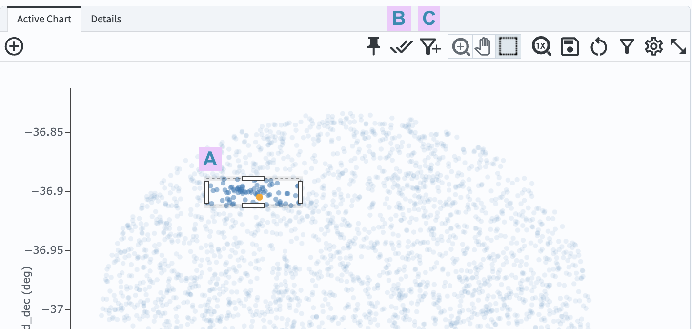
7. Use the box select tool. Click on the box icon (E in Figure 1). Click-and-drag in the plot to select points (A in Figure 2). Two new icons will appear to “select” (B in Figure 2) or “filter on” (C in Figure 2) the points.

Figure 2: After using the box select tool to create a box in the plot (A), two new icons appear (B and C).
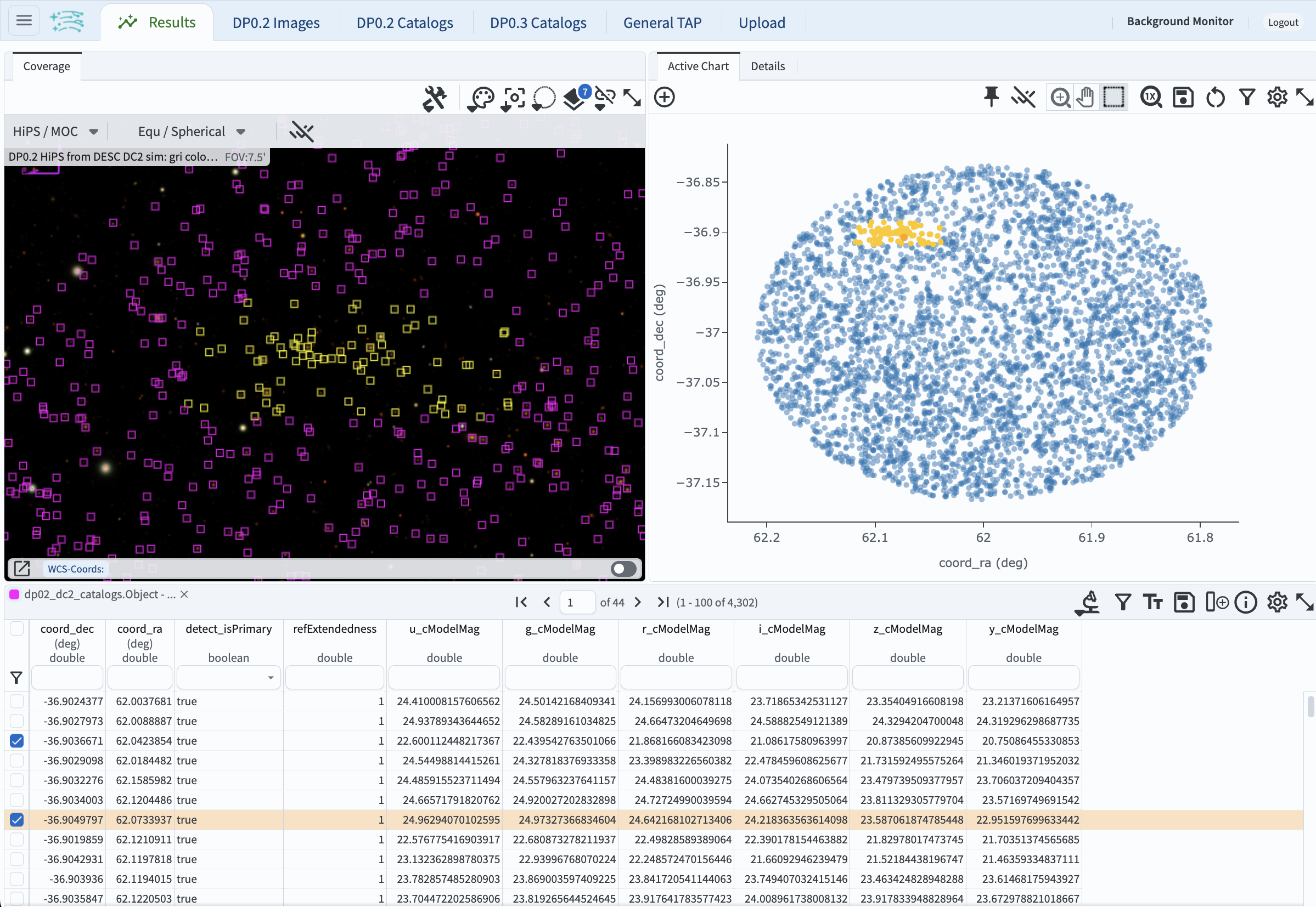
8. Select objects. Click on the select icon (B in Figure 2). The will be marked with a different color in the active chart and the coverage chart, and will be selected in the table, as shown in Figure 3.

Figure 3: The full Portal Results tab after points have been selected in the active chart.
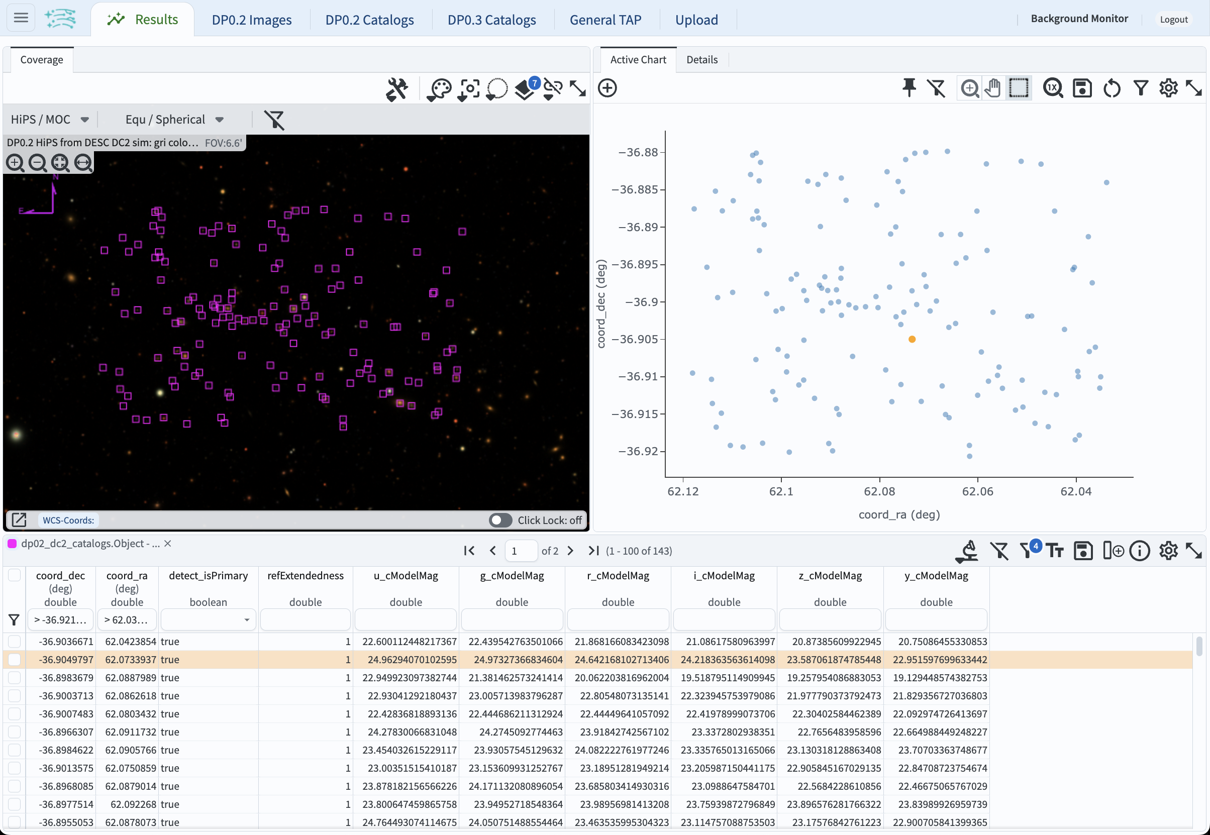
9. Filter on the selected objects. Click on the select icon (B in Figure 2) to unselect objects. Repeat step 7. Click on the filter icon (C in Figure 2). The selected objects will now be the only points shown in the active chart, the coverage map, and the table, as in Figure 4.

Figure 4: The full Portal Results tab after points have been selected and filtered on in the active chart.
10. Remove the filter. Click on the filter icon (C in Figure 2) to remove the filter and return to the default plot of Figure 1.
Return to the list of DP0.2 Portal tutorials.